

On this page 9 sections
A good room palette is usually three to five colors (counting neutrals and wood), with one clear lead color, one supporting color and a small accent, all chosen with the room’s light in mind. Color theory gives you the tools to pick those colors on purpose instead of by luck: the color wheel, the three properties of a color, undertones, and a handful of classic schemes. This guide walks through each, then gives you a step-by-step method and a way to test paint before you commit.
The three things every color has
Designers describe any color with three properties. Understanding them is the difference between “I like blue” and “I like a muted, mid-dark blue with a green undertone”.
- Hue is the color family: red, blue, green, yellow and so on.
- Value is how light or dark it is. Value does more work in a room than hue: two very different hues of the same value sit together quietly, while one hue in light and dark versions creates strong contrast.
- Saturation (also called chroma or intensity) is how pure or muted the color is. Bright saturated colors are energetic; muted, greyed or “dusty” colors are easier to live with in large amounts.
There’s also temperature. Reds, oranges and yellows read as warm; blues, greens and violets read as cool. But temperature is relative: a green with a lot of yellow in it is warmer than a blue-green, and a grey can be warm or cool depending on its undertone.
The color wheel, made practical
The color wheel arranges hues in a circle: the primaries (red, yellow, blue), the secondaries made by mixing them (orange, green, violet) and the tertiaries in between (such as blue-green or red-orange). Its use in a room is simple: it shows you which colors are neighbours and which are opposites.
- Neighbours (analogous colors) sit side by side and feel harmonious and calm.
- Opposites (complementary colors) sit across the wheel and make each other look more intense.
You don’t need to own a color wheel. A free one online, or simply knowing that blue’s opposite is orange, red’s is green and yellow’s is violet, covers most decisions.
Five classic color schemes for rooms
| Scheme | How it works | Feels | Example |
|---|---|---|---|
| Monochromatic | Several values and saturations of one hue | Calm, sophisticated | Pale sage walls, mid-green sofa, deep olive velvet cushion |
| Analogous | Two to four neighbouring hues | Harmonious, relaxed | Blue walls, teal cushions, green plants |
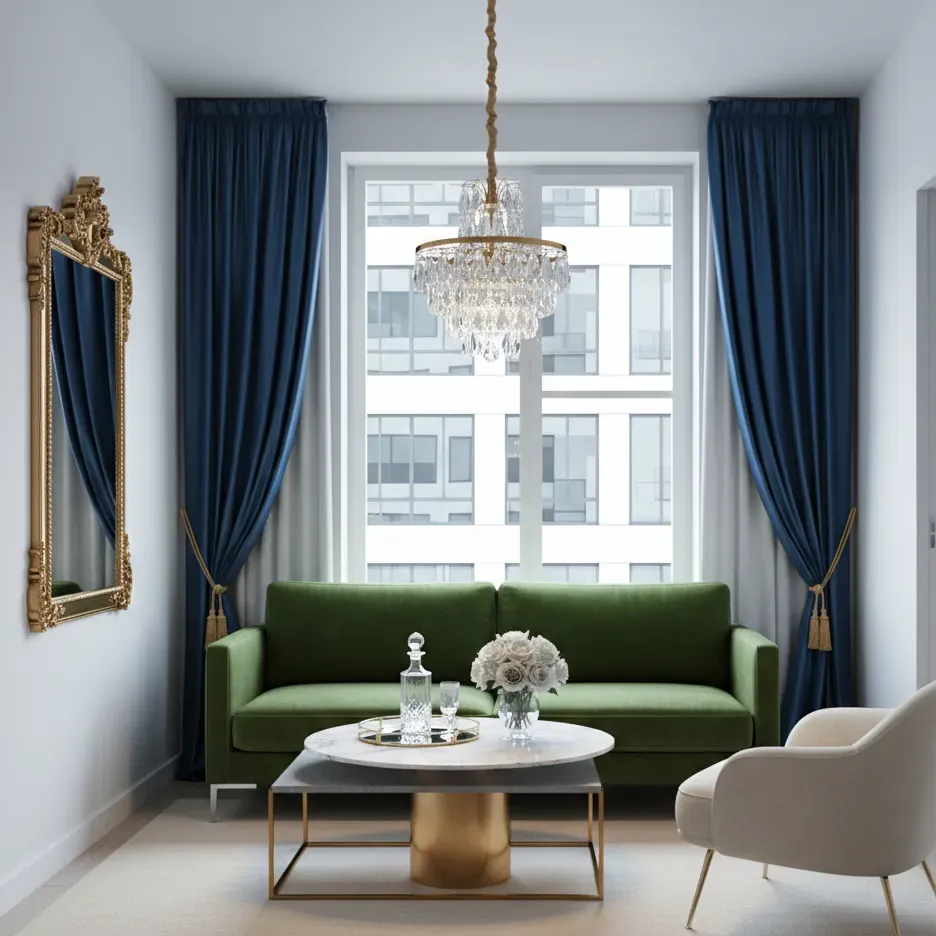
| Complementary | Two opposite hues, one dominant | Lively, balanced | Navy walls with rust, tan or cognac leather |
| Split-complementary | One hue plus the two neighbours of its opposite | Lively but softer | Blue with terracotta and gold |
| Triadic | Three hues evenly spaced around the wheel | Playful, bold | Muted red, mustard and blue in a kids’ room |
A neutral scheme (whites, beiges, greys, wood, black) isn’t on the wheel at all but follows the same logic: you still need a range of values and at least one warm or cool lean so it doesn’t go flat.
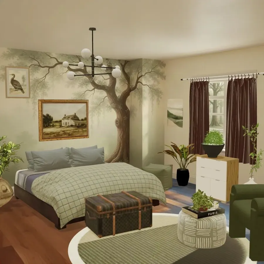
Complementary done well
Complementary schemes are the ones people most often get wrong, because two opposites at full strength in equal amounts fight each other. The fix is to let one color lead, mute at least one of them, and vary their values. Navy and cognac work beautifully; electric blue and bright orange in equal parts rarely do.
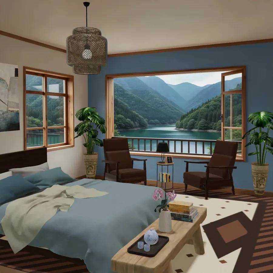
The 60-30-10 rule
The best-known proportion guide in interior design splits a room’s color roughly like this:
- 60% dominant color: walls, large rugs, maybe the sofa. Usually the quietest color.
- 30% secondary color: furniture, curtains, bedding, an accent wall.
- 10% accent: cushions, art, a lamp, flowers, small objects. Often the most saturated.
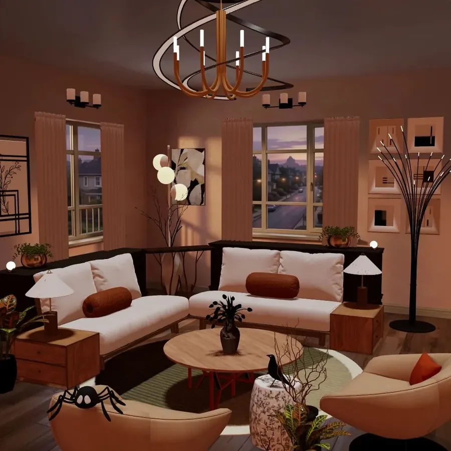
Here’s how the cover room breaks down. Terracotta walls and curtains take the lead, the cream sectional is the supporting color, with the peachy armchairs bridging the two, and rust cushions plus black lamps and metalwork are the accents:
- Terracotta wall
#C99A85 - Cream
#E9DED4 - Rust
#A7663F - Walnut
#8B5E3C - Iron black
#2A2524
Treat the numbers as a direction, not arithmetic. Wood floors, white ceilings and black frames don’t need to be counted. What matters is that one color clearly leads and the accent is small enough to stay special. If the accent creeps past a fifth of the room, it stops being an accent.
Undertones: why “white” is never just white
Most color mistakes in real homes aren’t about hue, they’re about undertones clashing. A cool blue-white ceiling over warm yellow-white walls looks dirty; a pink-beige sofa next to a green-grey wall looks off without anyone knowing why.
To read an undertone:
- Hold the sample against a sheet of plain white printer paper. The paper reveals whether it leans yellow, pink, green or blue.
- Compare it with other samples in the same family. Undertones jump out in a lineup of five greys more than they do alone.
- Look at the darkest color on the paint strip. It often shows the undertone more clearly than the pale one you’re considering.
Then match the lean across your big surfaces. Warm walls go with warm whites on the trim and warm woods; cool greys go with crisp whites and cooler metals. Mixing is possible, but do it on purpose.
How light changes color
The same paint can look like three different colors in three rooms. Some reliable patterns:
- North-facing rooms (in the northern hemisphere; south-facing in the southern) get cooler, indirect light. Cool colors can look cold and grey here; warmer whites and earthy colors usually look better.
- South-facing rooms get warm, strong light for much of the day. Most colors work, and cool colors feel fresher.
- East-facing rooms are bright and warm in the morning and cooler later; west-facing rooms are the reverse.
- Artificial light matters as much as daylight. Warm bulbs (around 2700K) push colors yellow and soften blues; cooler bulbs (4000K and up) make warm colors look flatter. Our guide to layered lighting covers bulbs in more detail.
Large areas also intensify color. A paint that looks muted on a chip can look much stronger across four walls, so many designers go a step lighter or more muted than the chip they first fall for.
How to build a palette, step by step
- Start with what’s staying. The floor, a sofa you love, a rug, a kitchen countertop. These set your undertones before you open a paint chart.
- Pick a mood in three words. “Calm, warm, natural” leads to a different palette than “crisp, bright, graphic”.
- Choose your lead color (the 60%). It’s usually a neutral or a muted color. Find its undertone.
- Choose a supporting color (the 30%) using a scheme from the table: a neighbour for calm, an opposite for energy.
- Choose one accent (the 10%). Repeat it at least three times around the room.
- Add a dark anchor. A black frame, a dark wood table, a charcoal cushion. Almost every palette looks better with one deep value.
- Test before you buy. Paint large samples (at least A4 size, ideally bigger) on two or three walls and look at them morning, afternoon and evening for a few days.
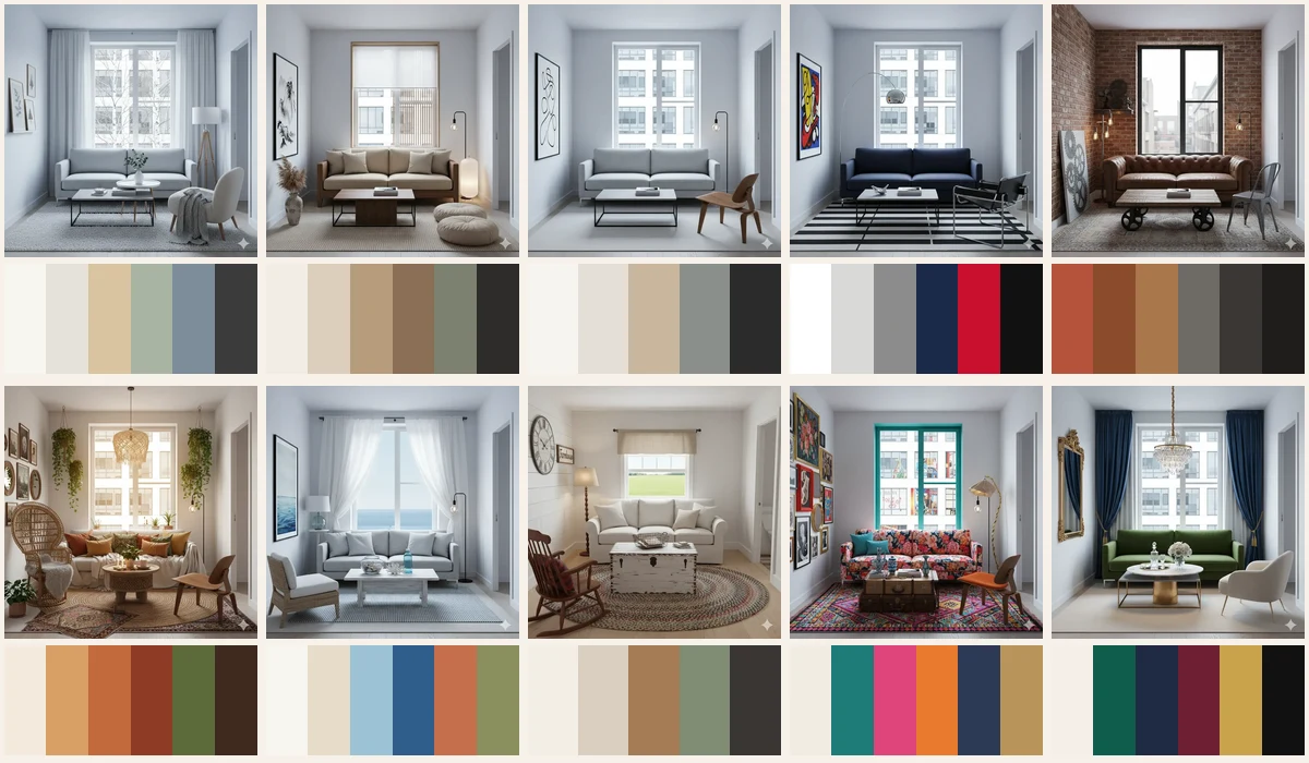
If you’re not sure what mood you’re after, the design style quiz or one room styled ten ways can show you which palettes you naturally gravitate to.
Common color mistakes
- Everything at the same value. A beige sofa on a beige rug against beige walls. Vary the lightness even if you keep the hue.
- Choosing paint first. There are thousands of paint colors and far fewer sofas. Choose the fabric, then match the paint.
- Testing on a tiny chip. Small samples lie. Test big, on several walls.
- Ignoring the ceiling and trim. A stark white ceiling over warm walls can look cold. Consider a slightly tinted white or the wall color at reduced strength.
- Too many accents. Three accent colors each used once look accidental. One accent used three times looks designed.
Try it in Cozee
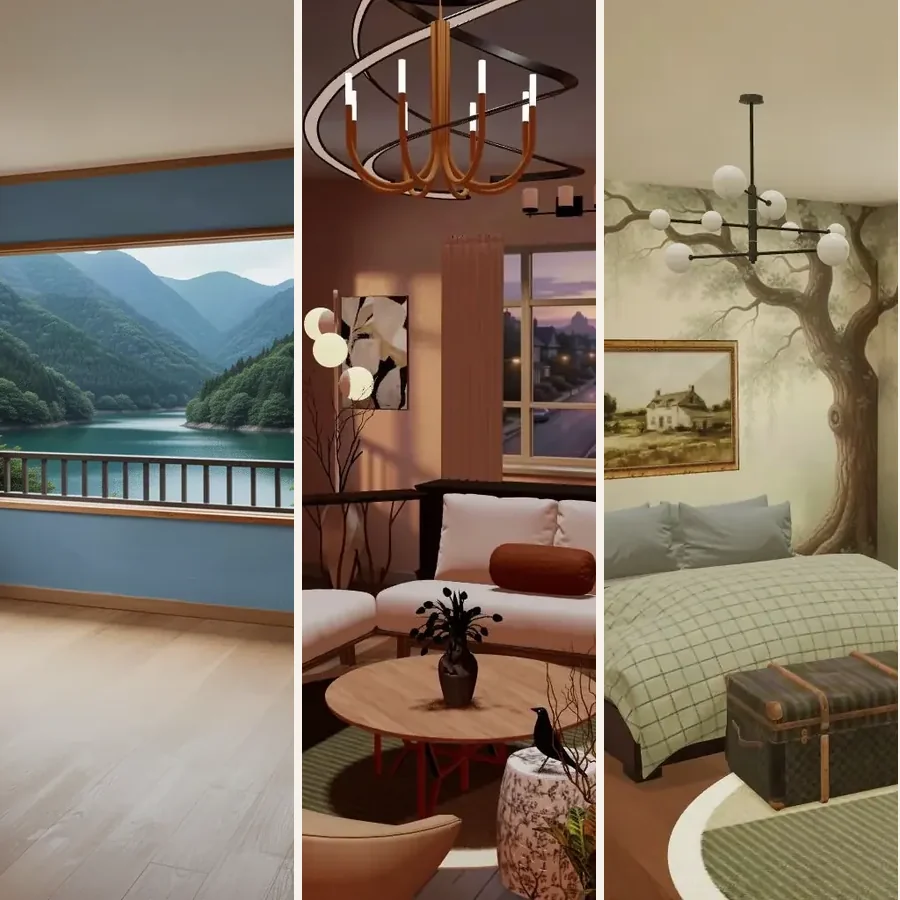
Paint and furniture are expensive to get wrong, so it helps to rehearse a palette first. In Cozee, a free design game for iPhone and Android, every room starts empty and you furnish it with real 3D sofas, rugs, lamps, plants and art, which makes it easy to try a monochromatic version of a room, then a complementary one. Other players rate each design, and you can see how others colored the same room. Then come back to our design principles to check balance and contrast.
Questions people ask
What is the 60-30-10 rule in interior design?
It’s a guide for proportioning color: about 60% of the room in a dominant color (usually walls and large surfaces), 30% in a secondary color (furniture, curtains, a rug) and 10% in an accent (cushions, art, small objects). The exact numbers don’t matter; the point is one clear lead color, one supporting color and a small, punchy accent.
How many colors should a room have?
Most rooms look settled with three to five colors, counting neutrals like white, wood and black. You can use several shades of each. Beyond that, the room usually needs a strong unifying idea, as in eclectic or maximalist styles, to avoid looking random.
What is an undertone in paint?
An undertone is the subtle color sitting underneath the main one. A white can lean yellow, pink, blue or green; a grey can lean warm (beige, taupe) or cool (blue, green). You see undertones most clearly when you hold a sample next to pure white paper or next to another neutral.
Why does paint look different on my wall than on the chip?
The light in your room, the size of the painted area and the colors around it all change how you see a color. Large areas usually look lighter and more intense than a small chip, and the same paint looks cooler in north-facing rooms and warmer in south-facing ones (in the northern hemisphere). Always test a large sample on more than one wall.
Do warm or cool colors make a room look bigger?
Cool, light colors tend to feel like they recede, which can make walls feel further away, while warm, dark colors feel like they advance. But contrast matters as much: painting walls, trim and ceiling in close tones blurs the edges of a small room and often does more than the color choice itself.
Try it in an empty room first
Cozee is a free interior design game for iPhone and Android. Pick an empty 3D room, fill it with real furniture, and see what the community thinks.
4.7 on the App Store · Free, with optional in‑app purchases