

On this page 13 sections
Every interior style has its own color palette, and knowing it is the quickest way to make a room look like the style you want. Below are ten ready-made palettes, one for each of the ten main interior design styles, with hex codes and a simple plan for where each color goes: about 60% for the main color (walls, big rug), 30% for the supporting color (sofa, curtains, wood) and 10% for the accent (cushions, art, a lamp). These are the same palettes used in each of our style guides, so they match.
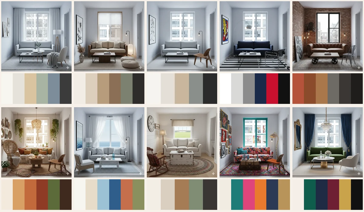
The cover shows the same small living room styled all ten ways, with its palette in a strip underneath. Top row, left to right: Scandinavian, Japandi, minimalist, modern and industrial. Bottom row: bohemian, coastal and Mediterranean, rustic farmhouse, eclectic and luxury glam. It’s a good way to see how much a palette changes a room on its own, even when the window, walls and layout stay the same.
How to use these palettes
A palette isn’t a recipe where every color gets equal space. Use it like this:
- Pick the lightest or quietest color as your 60%. That’s usually the walls and the biggest rug.
- Choose one or two supporting colors for the 30%. Sofa, curtains, bedding, wood furniture.
- Keep the boldest color for the 10%. Cushions, a throw, art, flowers, a lamp.
- Repeat each color in at least two or three places, so it looks planned.
- Treat dark colors as lines unless the style is meant to be moody: frames, lamp stems, chair legs.
The numbers are a direction, not arithmetic. Wood floors and white ceilings don’t need counting. Our guide to color theory for rooms explains the 60-30-10 rule and undertones in more depth, and how to choose paint colors covers testing them on your walls.
Scandinavian: soft, light and Nordic
- Snow
#F7F5F0 - Fog
#E6E2DA - Birch
#D9C3A0 - Sage
#A8B5A2 - Fjord
#7D8C99 - Charcoal
#3B3B3B
- 60%: Snow and Fog on walls and a pale rug.
- 30%: Birch in floors and furniture, Fog on the sofa.
- 10%: Sage or Fjord in cushions and prints; Charcoal only as thin lines.
Keep whites warm, not stark. Full guide: Scandinavian interior design.
Japandi: grounded and earthy
- Rice paper
#F2EDE4 - Sand
#DCCFBD - Oak
#B89C7D - Walnut
#8A6F55 - Olive
#7C8270 - Charcoal
#2F2C2A
- 60%: Rice paper walls, Sand rug.
- 30%: Oak and Walnut together in furniture; a Sand sofa.
- 10%: Olive in a plant or cushion, Charcoal in a lamp, table or frame.
The dark tones are what make it Japandi rather than Scandinavian, so don’t skip them. Full guide: Japandi interior design, and see Scandinavian vs Japandi for the differences.
Minimalist: calm and quiet
- Warm white
#F6F4F0 - Greige
#E4DFD7 - Oak
#C9B79C - Stone grey
#8A8F8C - Charcoal
#2B2B2B
- 60%: Warm white walls.
- 30%: Greige or Stone grey on the sofa and rug, a little Oak.
- 10%: Charcoal as a drawing tool: one frame, a lamp stem, table legs.
Decide early whether you’re warm or cool and keep undertones consistent. Full guide: minimalist interior design.
Modern: crisp and graphic
- White
#FFFFFF - Concrete
#D9D9D6 - Steel
#8C8C8C - Navy
#1B2A4A - Signal red
#C8102E - Black
#111111
- 60%: White walls, Concrete floor or rug.
- 30%: Navy on a big piece like the sofa, Steel in metal frames.
- 10%: Signal red in one or two places (a painting, a chair) and Black for contrast.
Keep the red rare so it reads as deliberate. Full guide: modern interior design.
Industrial: raw and warm
- Brick
#B5523B - Rust
#8A4B2D - Cognac
#A8774B - Concrete
#6E6A64 - Iron
#3A3734 - Soot
#1E1D1C
- 60%: Brick on one wall, Concrete on the rest or the floor.
- 30%: Cognac leather and Rust in wood and textiles.
- 10%: Iron and Soot in window frames, lamps and table legs.
Industrial is the one palette here where the 60% can be dark. If your room is small, keep the walls pale and let brick, leather and metal carry the color. Full guide: industrial interior design.
Bohemian: sun-baked and earthy
- Cream
#F3E9DC - Ochre
#D9A066 - Terracotta
#C26A3D - Rust
#8E3B26 - Moss
#5B6B3A - Cocoa
#3E2A20
- 60%: Cream walls and a natural jute rug.
- 30%: Ochre and Terracotta in the sofa, a patterned rug and curtains.
- 10%: Rust, Moss (plus real plants) and Cocoa in cushions, baskets and wood.
Pick two or three main colors and let them repeat across all the pattern. Full guide: bohemian interior design.
Coastal and Mediterranean: sunlit and breezy
- Whitewash
#F7F5F0 - Sand
#E6DCC8 - Sea glass
#9CC3D5 - Aegean blue
#2F5D8A - Terracotta
#C46F4B - Olive
#8A8F5E
- 60%: Whitewash walls, Sand in linen and natural fibers.
- 30%: Sea glass in textiles and glass, Sand on the sofa.
- 10%: Aegean blue in strong small doses, Terracotta and Olive for a Mediterranean lean.
For pure coastal, drop the terracotta and olive. Full guide: coastal and Mediterranean style.
Rustic farmhouse: warm and homey
- Farmhouse white
#F3EEE4 - Oat
#D9CFC0 - Weathered oak
#A47C55 - Sage
#7F8C74 - Iron black
#3A3632
- 60%: Farmhouse white walls and slipcovers.
- 30%: Oat in textiles and Weathered oak in furniture and beams.
- 10%: Sage in cushions or a painted piece, Iron black in hardware and lights.
Avoid cold, pure white, which makes wood look thin. Full guide: rustic farmhouse style. For a softer, more floral take, see cottagecore living room ideas.
Eclectic: bold, with structure
- Plaster
#F2ECE2 - Teal
#1E7C78 - Peony pink
#E0457B - Marigold
#E87A2E - Ink blue
#2C3A55 - Old brass
#B9945A
- 60%: Plaster walls, so the colors have somewhere to rest.
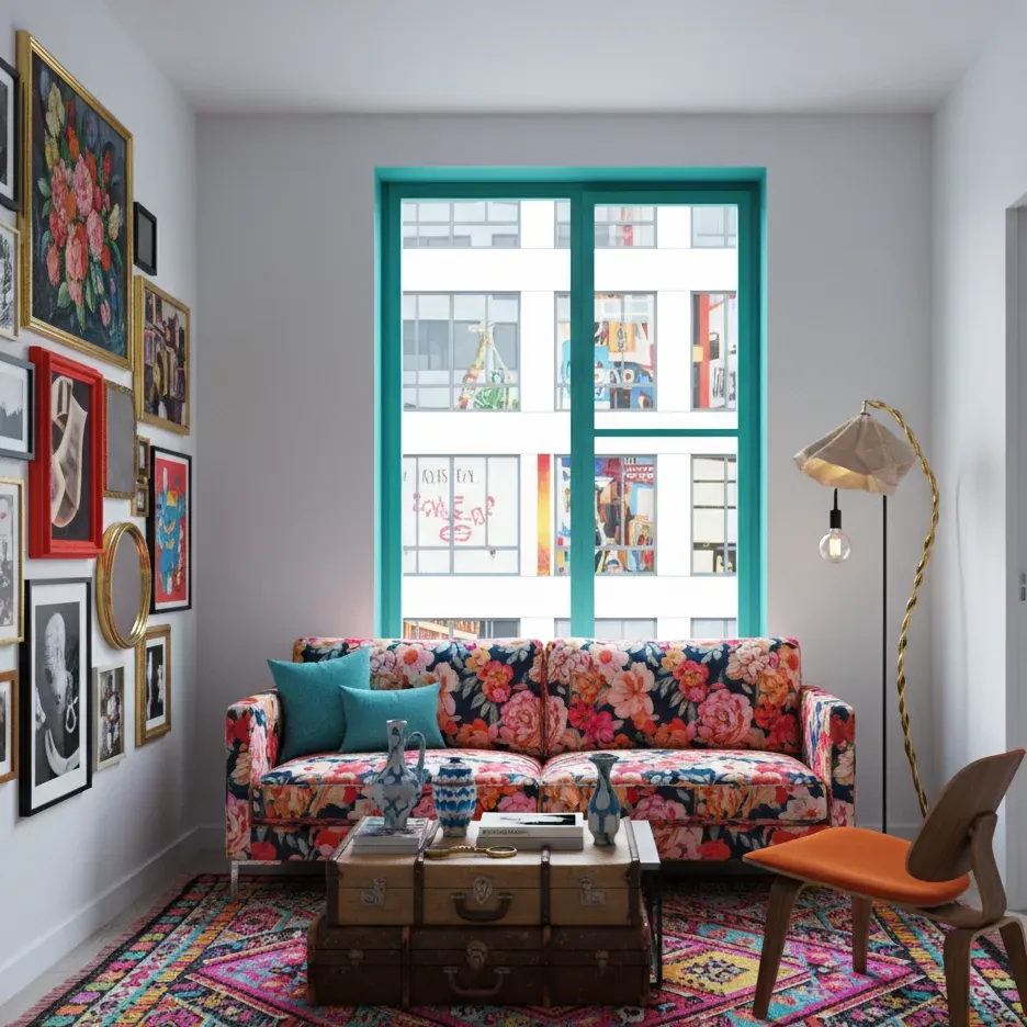
- 30%: Teal leads, in a big piece like a painted window frame, sofa or rug.
- 10%: Peony pink and Marigold in pattern and art, Ink blue for depth, Old brass as the one metal.
Eclectic rooms can bend the 60-30-10 rule more than most, but they still need one clear lead color. Full guide: eclectic interior design. Not sure whether you’re eclectic, boho or maximalist? Read boho vs eclectic vs maximalist.
Luxury glam: rich and polished
- Ivory
#F4EFE6 - Emerald
#0F5C4A - Midnight navy
#1F2A44 - Burgundy
#6E1F33 - Antique gold
#C9A24A - Black lacquer
#111111
- 60%: Ivory walls, or Midnight navy for a moody room.
- 30%: One jewel tone in velvet: Emerald, Navy or Burgundy, not all three at full strength.
- 10%: Antique gold in lighting, mirrors and table bases; Black lacquer for contrast.
Pick one jewel tone, one metal and one neutral. Full guide: luxury glam interior design.
Choosing between palettes
If two or three palettes appeal to you, these questions help:
- How much daylight do you get? Dim, north-facing rooms suit warm palettes like Japandi, boho or farmhouse better than cool white-and-grey ones.
- What can’t you change? Start from your floor, kitchen or sofa color and pick the palette that already includes it.
- How often do you like to change things? Neutral bases (Scandinavian, minimalist, Japandi) let you swap the 10% each season without repainting.
- Do you want calm or energy? Low-contrast palettes calm a room; high-contrast ones (modern, eclectic, glam) wake it up.
You can also blend two palettes, roughly 80/20: keep the 60% and 30% from your main style and borrow just the accent from another. The style quiz is a quick way to find your main style first.
All ten style guides, side by side:
Try it in Cozee
The easiest way to feel the difference between palettes is to style the same room twice. In Cozee, a free design game for iPhone and Android, every Space starts empty and you furnish it with real 3D furniture and decor, with no timer. Try a warm Japandi palette in one design, then a cooler Scandinavian one in the same Space, and compare how other players rate each. Once you reach level 5, the pro editor tools add material options for many pieces, so you can try the same piece in different finishes.
Questions people ask
How many colors should an interior color palette have?
Most rooms look settled with three to five colors, counting neutrals like white, wood and black. A palette of five or six gives you shades to choose from; you don’t have to use every one in every room.
How do I use a color palette in a room?
Follow the 60-30-10 rule as a guide: the lightest or quietest color covers about 60 percent (walls, big rug), a supporting color about 30 percent (sofa, curtains, wood), and an accent about 10 percent (cushions, art, a lamp). Repeat each color in at least two or three places.
What is the most timeless interior color palette?
Warm neutrals with natural wood and one dark accent, like the Scandinavian, Japandi or minimalist palettes here, age the most gracefully. They’re easy to refresh by changing the accent color in cushions and art rather than repainting.
Can I mix palettes from two styles?
Yes. Keep the base and supporting colors from your main style and borrow only the accent from the second, roughly 80/20. For example, a Scandinavian base with a terracotta accent from the boho palette feels warmer without losing its calm.
Try it in an empty room first
Cozee is a free interior design game for iPhone and Android. Pick an empty 3D room, fill it with real furniture, and see what the community thinks.
4.7 on the App Store · Free, with optional in‑app purchases