


On this page 9 sections
To choose a paint color, start from what isn’t changing (the floor, the sofa, the kitchen), pick a color whose undertone agrees with them, and test two or three large samples on different walls for a couple of days, in morning light, daylight and lamplight. Account for which way the room faces, go a shade lighter or more muted than the chip you fall for, and choose the finish by how much wear the wall gets: matte for living rooms and bedrooms, eggshell or satin for halls and kitchens, semi-gloss for trim. Here’s how to do each step without repainting twice.
Start with what’s staying
Paint is the cheapest thing in the room to change, so choose it last, or at least after you know what it has to live with. Before you look at a single chip, list the fixed things:
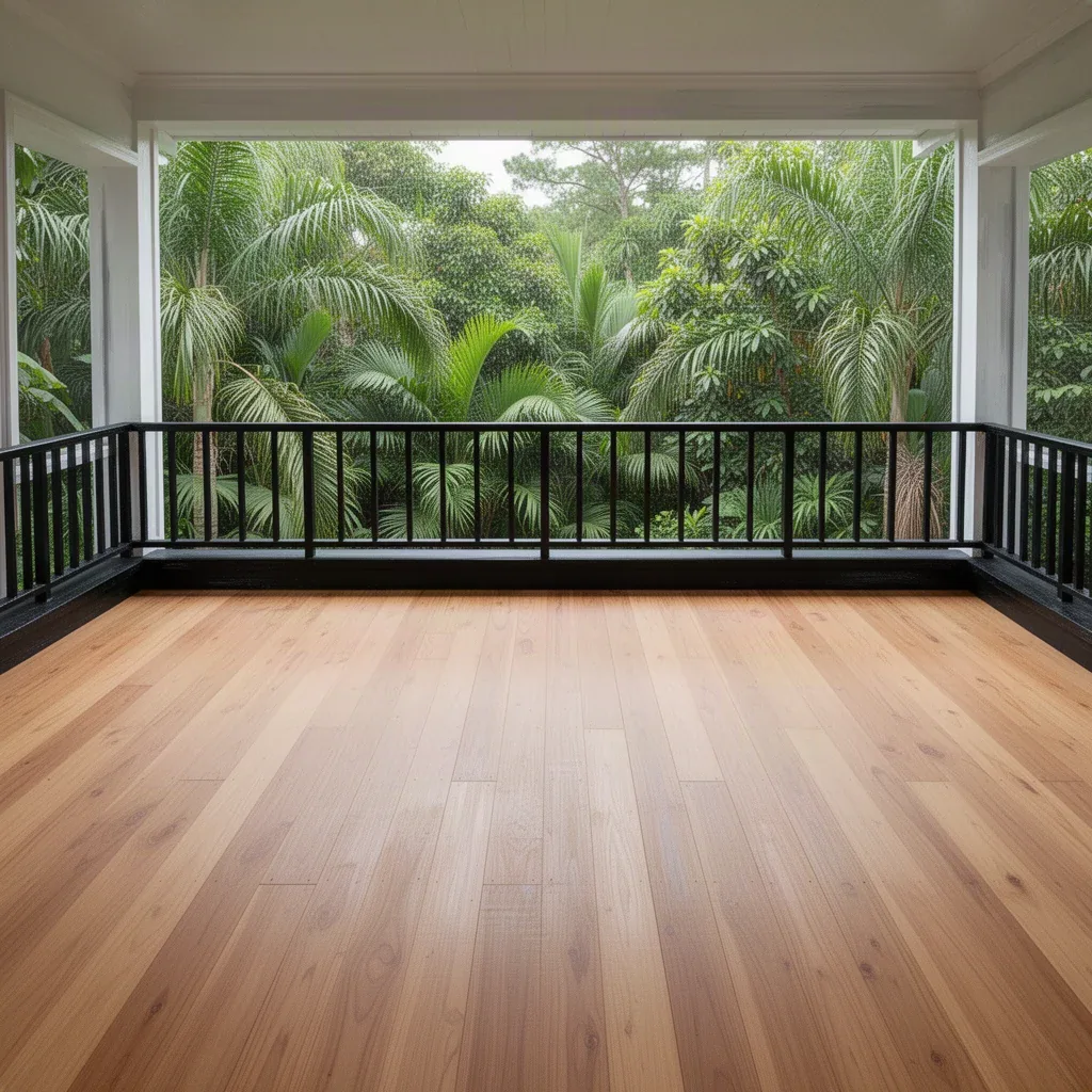
- The floor. Oak, pine, walnut, concrete and tile all have strong undertones.
- The big furniture. The sofa, the bed, a large rug or a kitchen you can’t replace.
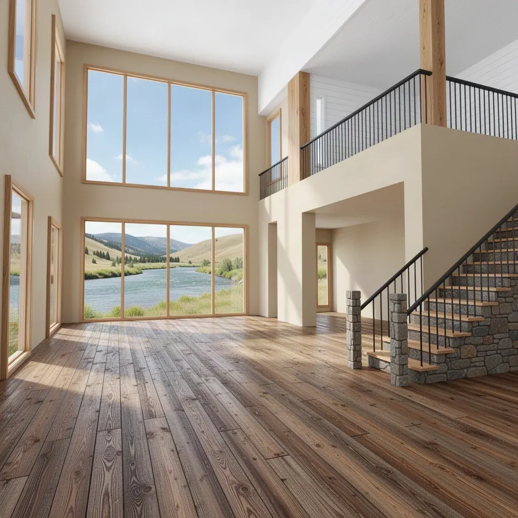
- The view. A window full of trees or sea is part of the palette, as our guide to color theory for rooms explains.
Take a cushion, a floorboard offcut or a photo of the sofa with you when you look at paint. A color that looks perfect on a white card can clash with a warm wooden floor.
Read the undertone
Almost every color leans slightly toward another: a white leans yellow, pink, green or blue; a grey leans warm (beige, taupe) or cool (blue, green). That lean is the undertone, and clashing undertones are why a perfectly nice grey can look dirty in your room.
Quick ways to see it:
- Hold the chip against plain white printer paper. The lean shows up immediately.
- Compare it with its neighbors. In a line of five whites, the yellow one and the blue one jump out.
- Look at the darkest color on the paint strip. It shows the family more clearly than the pale one.
Then match the lean: warm walls with warm woods and creamy whites; cool walls with crisp whites, cooler stone and black or chrome metals. You can mix warm and cool, but do it on purpose, usually by keeping one temperature dominant.
Test samples properly
Tiny chips lie. A color covering four walls looks stronger, and usually darker, than on a card, because the walls reflect it back onto each other. Many designers choose a step lighter or more muted than their first pick for that reason.
- Narrow it to two or three colors. More than that and they blur together.
- Paint big swatches, at least A3 or about 30 × 40 cm (12 × 16 in), bigger if you can. Two coats, the way the wall will be.
- Use sample boards or white card if you can, so the old wall color doesn’t affect what you see, and so you can move them.
- Test on several walls: one next to the window, one opposite it, one in the darkest corner.
- Look at different times of day: morning, midday, evening and under your own lamps at night.
- Live with them for two or three days before deciding. The one you still like on the third evening is usually right.
Let the light decide
The direction a room faces changes how every color looks. These patterns are for the northern hemisphere; in the southern hemisphere, swap north and south.
| Room faces | Light | What usually works |
|---|---|---|
| North | Cool, soft and even all day | Warm whites, creams, earthy colors, or go deep and cozy. Icy greys can look cold. |
| South | Warm and strong for much of the day | Almost anything. Cool colors feel fresher here. |
| East | Bright and warm in the morning, cooler later | Colors that work in both: soft warm neutrals, gentle greens |
| West | Cool in the morning, warm and golden in the evening | Colors that don’t turn orange at sunset: muted mid-tones |
Artificial light matters as much as daylight, especially in rooms you mostly use at night. Warm bulbs push colors toward yellow and soften blues; cool bulbs flatten warm colors. Our guide to layered lighting explains bulb color temperature. And if you haven’t yet watched how light moves through the room, how to read a room shows how.
Many paint charts also list an LRV (light reflectance value) from 0 (black) to 100 (pure white). It’s a useful shortcut: a higher LRV bounces more light around a dark room, a lower one absorbs it and feels more enclosing.
Pick the right sheen
The finish changes how a color looks and how well it survives fingers, steam and scuffs. The names vary between brands, but the order is the same from flat to shiny:
| Finish | Looks | Durability | Best for |
|---|---|---|---|
| Flat or matte | Soft, chalky, hides bumps | Least washable (though “scrubbable matte” paints exist) | Ceilings, living rooms, bedrooms, uneven walls |
| Eggshell | Very slight glow | Wipeable | Living rooms, dining rooms, hallways |
| Satin | Soft sheen | Good for wiping | Kitchens, bathrooms, children’s rooms, busy halls |
| Semi-gloss | Clearly shiny, shows flaws | Very durable | Trim, doors, skirting, cabinets |
| Gloss | Mirror-like | Toughest | Doors, furniture, accent trim |
The shinier the finish, the more it shows dents and patchy plaster, and the slightly darker and richer the same color will look.
Ceilings and trim
The ceiling is the fifth wall, and the trim is the frame around everything else.
- A flat white ceiling is the safe default and reflects the most light.
- A tinted ceiling, the wall color mixed at a fraction of its strength, looks softer than stark white and stops the ceiling from feeling separate.
- The same color on walls, ceiling and trim (“color drenching”) makes a room feel calm and enveloping, and it hides awkward angles in attics and small rooms.
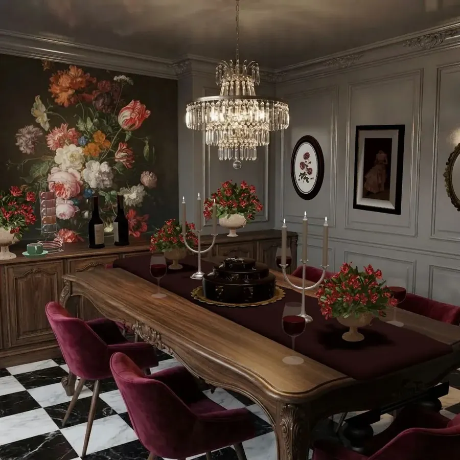
- A darker ceiling can make a tall room feel cozier; it rarely helps a low one.
- Trim in a contrasting white looks crisp and traditional. Trim in the wall color, perhaps in a shinier finish, looks modern and makes the room seem larger.
How many colors?
For one room, a simple structure is the 60-30-10 rule: about 60% of the room in a main color (usually the walls), 30% in a secondary color (big furniture, curtains, a rug) and 10% in an accent. The color theory guide has worked examples, and our interior design color palettes give ready-made combinations.
For a whole home, three to five colors that share an undertone is plenty. Rooms you can see from each other should at least agree with each other, even if they aren’t the same color.
Common paint mistakes
- Choosing from a chip without testing it in the room.
- Ignoring the undertone of the floor and sofa.
- Testing on one wall only, usually the bright one.
- Too many whites in one view: a yellow-white wall, a blue-white ceiling and a grey-white trim fight each other.
- The wrong sheen: high gloss on a bumpy wall, or flat matte in a hallway full of fingerprints.
- Painting before the furniture is chosen. It’s much easier to find paint for a sofa than a sofa for a paint.
Painting on a budget? See our budget room makeover guide. Renting? Check with your landlord first, and see decorating a rental for changes you can undo.
Try it in Cozee
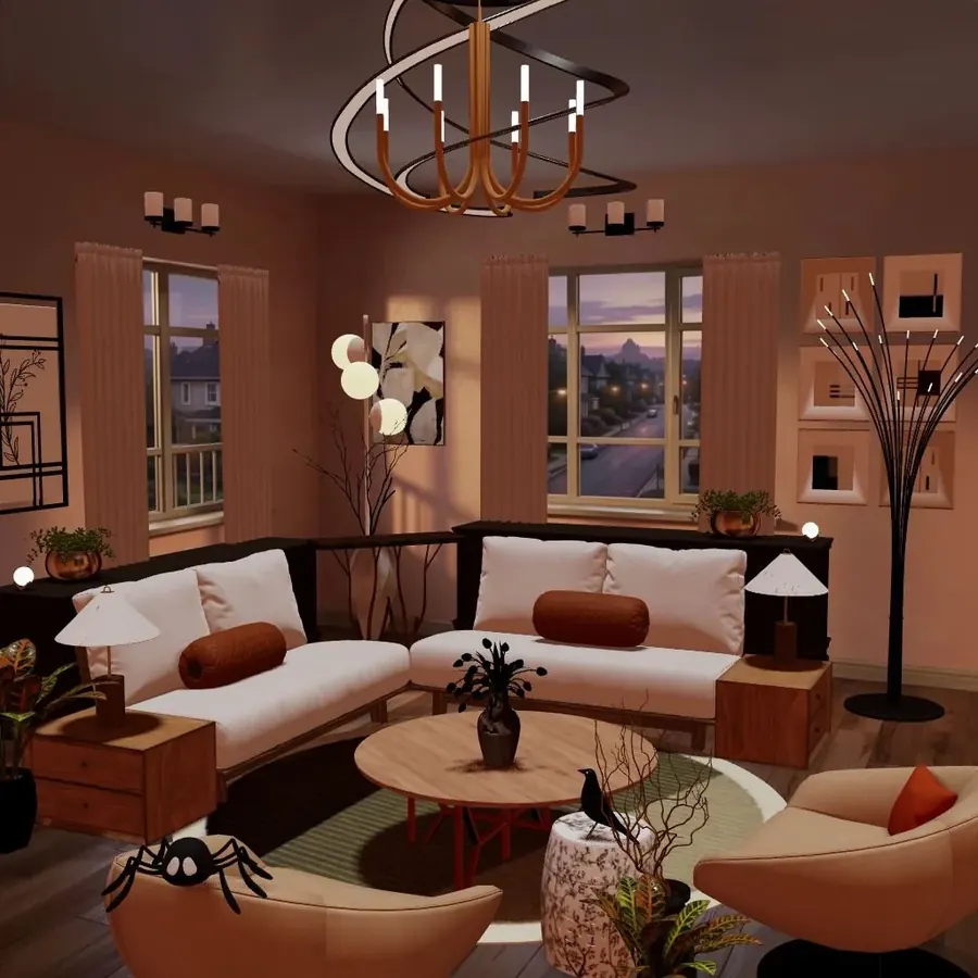
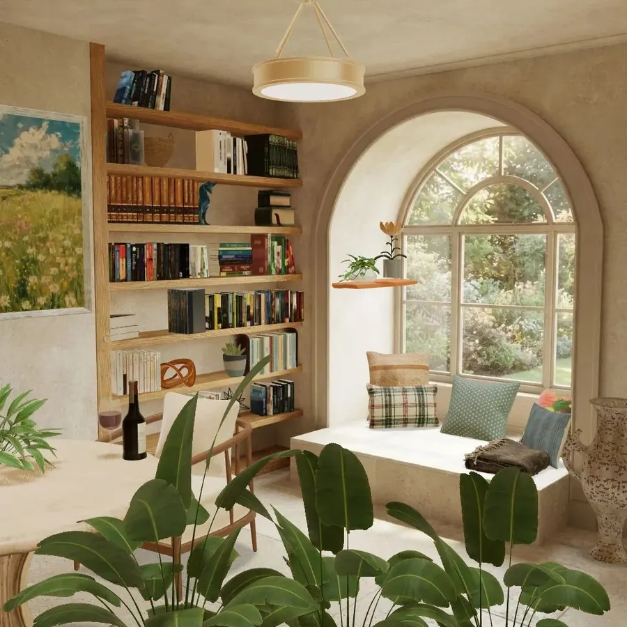
A paint color is easier to judge once a room is furnished. In Cozee, a free design game for iPhone and Android, the walls of each Space are already set, so you practise the other half of the job: choosing a sofa, rug, curtains and accents that agree with a slate-blue wall or a warm terracotta one, like the rooms in the cover image. Pay attention to which undertones look right next to the wall, then use that when you pick samples for your own home.
Questions people ask
How do I choose a paint color for a room?
Start from what’s staying (floor, sofa, cabinets), pick a color whose undertone matches them, and narrow it to two or three samples. Paint large swatches on different walls and look at them in morning light, daylight and lamplight for a couple of days before deciding.
Which paint finish is best for walls?
Matte or flat hides bumps and looks soft, and suits living rooms, bedrooms and ceilings. Eggshell or satin is easier to wipe and suits hallways, kitchens and children’s rooms. Semi-gloss is the usual choice for trim, doors and areas that get wet.
What color should I paint a north-facing room?
In the northern hemisphere, north-facing rooms get cooler, softer light, so warm whites, creams and earthy colors usually look better than icy greys. In the southern hemisphere the same applies to south-facing rooms. Testing a sample in the room is the only sure answer.
Should the ceiling be white?
Not necessarily. A flat white ceiling is a safe default, but a ceiling tinted with a little of the wall color looks softer, and painting the ceiling the same color as the walls makes a room feel enveloping. A dark ceiling can make a tall room cozier.
Try it in an empty room first
Cozee is a free interior design game for iPhone and Android. Pick an empty 3D room, fill it with real furniture, and see what the community thinks.
4.7 on the App Store · Free, with optional in‑app purchases