

On this page 11 sections
The principles of interior design are a short set of ideas that explain why some rooms feel right and others don’t: balance, rhythm, emphasis, contrast, scale and proportion, harmony and detail. They don’t tell you which style to pick. They help you arrange whatever you own so the room feels calm, intentional and finished. This guide explains each one in plain terms, shows what it looks like in a real room, and ends with a checklist you can walk through in your own home.
Why principles beat rules
Most decorating “rules” (hang art at eye level, put the rug under the front legs) are really these principles turned into numbers. Once you understand the idea underneath, you know when a rule applies and when you can break it. If a room feels wrong and you can’t say why, run through the seven principles in order; the problem is almost always one of them.
A useful idea before we start is visual weight: how strongly an object pulls the eye. Dark, large, solid, shiny or busily patterned things feel heavy. Pale, small, leggy, transparent or plain things feel light. Most of the principles below are about where you put that weight.
1. Balance: spreading the visual weight
Balance is the feeling that no side of the room is heavier than the other. There are three kinds.
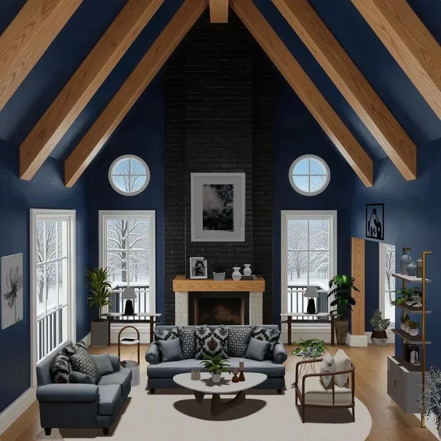
Symmetrical balance
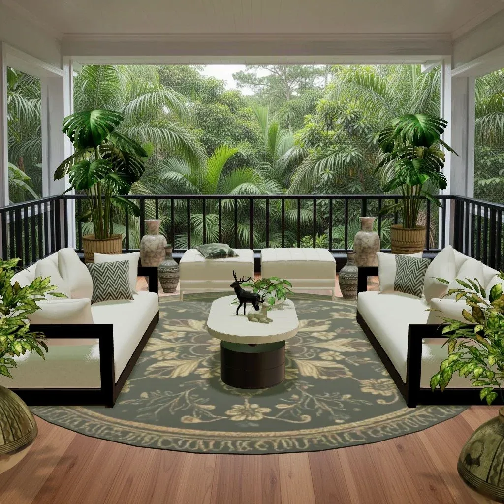
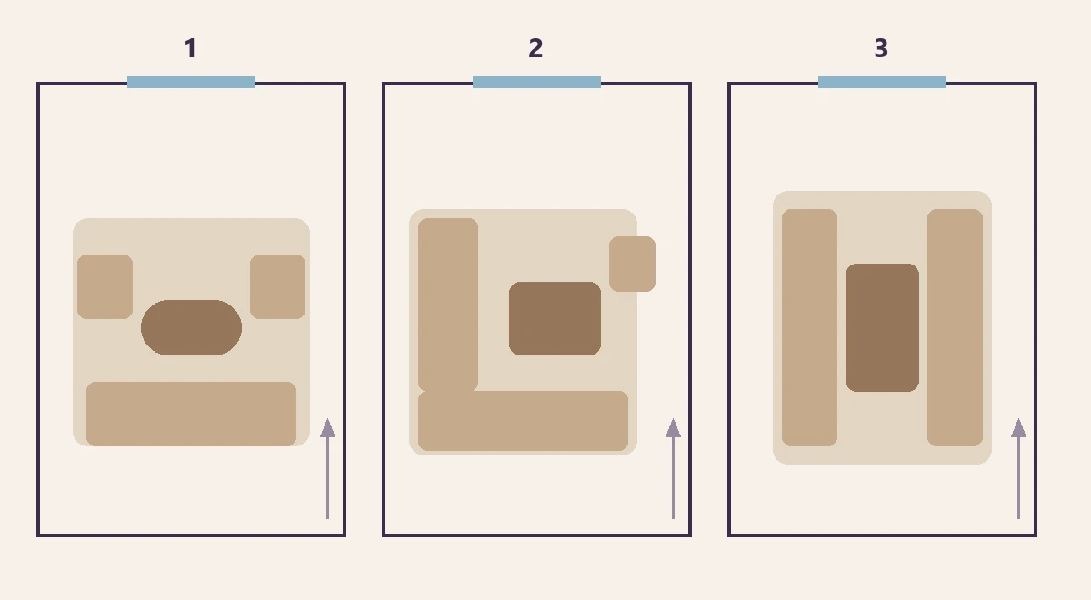
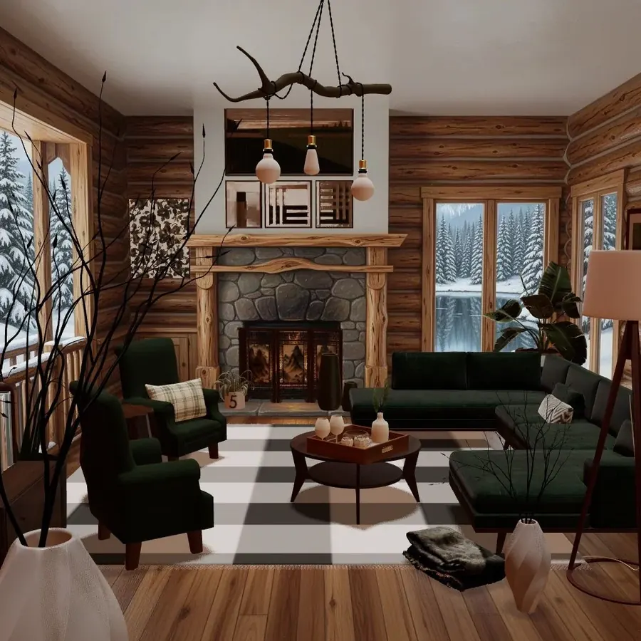
One side mirrors the other around a center line: a fireplace with an armchair on each side, a bed with matching nightstands and lamps. It feels formal, restful and traditional, and it’s the easiest way to make a room look composed.
Asymmetrical balance
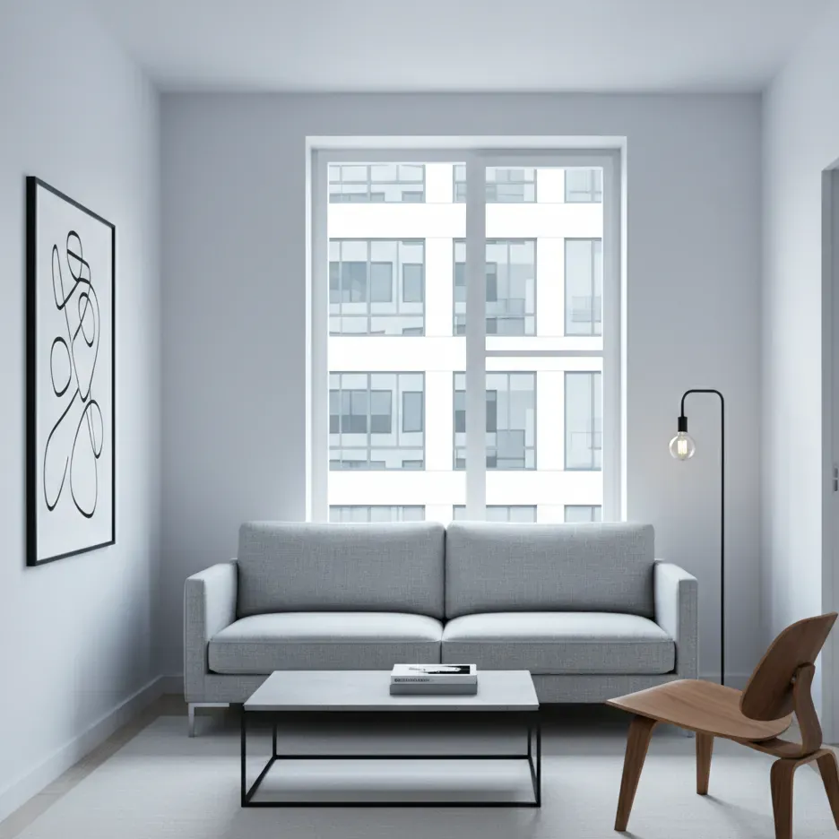
The two sides differ but feel equally weighted. A tall bookcase on one side might be balanced by a large painting plus a floor lamp on the other. Asymmetry feels more relaxed and modern, but it takes more judgment: squint at the room and ask whether one side looks like it’s tipping.
Radial balance
Everything arranges around a center point: chairs around a round table, a round rug with seating circling it, a chandelier above. It works well in dining rooms, entrance halls and conversation areas.
Don’t forget vertical balance. If everything is at sofa height and the walls are bare, the room feels bottom-heavy. Art, tall plants, shelving and curtains lift the eye.
2. Rhythm: repetition that moves the eye
Rhythm is what carries your eye around a room instead of letting it stop at one spot. Designers usually describe four ways to create it:
- Repetition: the same color, shape or material appearing several times. A rust cushion on the sofa, a rust vase on the shelf and a rust stripe in the rug connect three corners of a room.
- Progression: a gradual change in size or color, like a set of nesting tables or candles of different heights.
- Transition: a smooth line that leads the eye, such as an arched doorway or a curved sofa.
- Contrast: alternating opposites, like black and white tiles. (More on contrast below.)
A practical rule of thumb: repeat an accent color at least three times in a room, in different objects and at different heights. Once looks like an accident; three times looks like a plan.
3. Emphasis: give the room a focal point
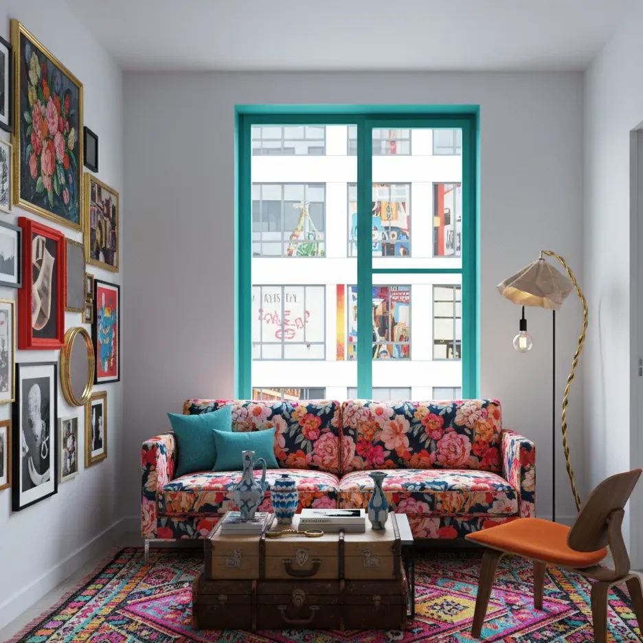
Emphasis means deciding what the eye should land on first. A room with no focal point feels scattered; a room with five competing focal points feels chaotic.
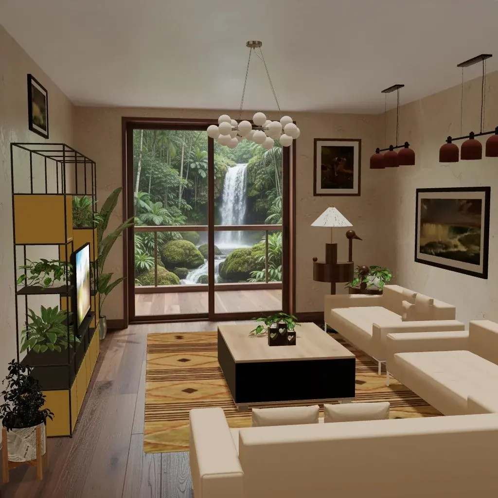
Natural focal points are a fireplace, a large window with a view, or a built-in feature. If your room has none, create one with a large piece of art, a bold headboard, a statement light or a painted feature wall.
Then arrange around it. Face the main seating toward the focal point (or at least make sure it’s visible from the seats), keep the area around it uncluttered and light it well. Everything else in the room should be quieter than the star.
4. Contrast: keeping things alive
Contrast is the difference between neighbouring things: light against dark, smooth against rough, round against square, old against new. Without contrast a room reads as flat, even if every piece in it is lovely.
Ways to add it:
- A dark coffee table on a pale rug, or a pale sofa against a dark wall.
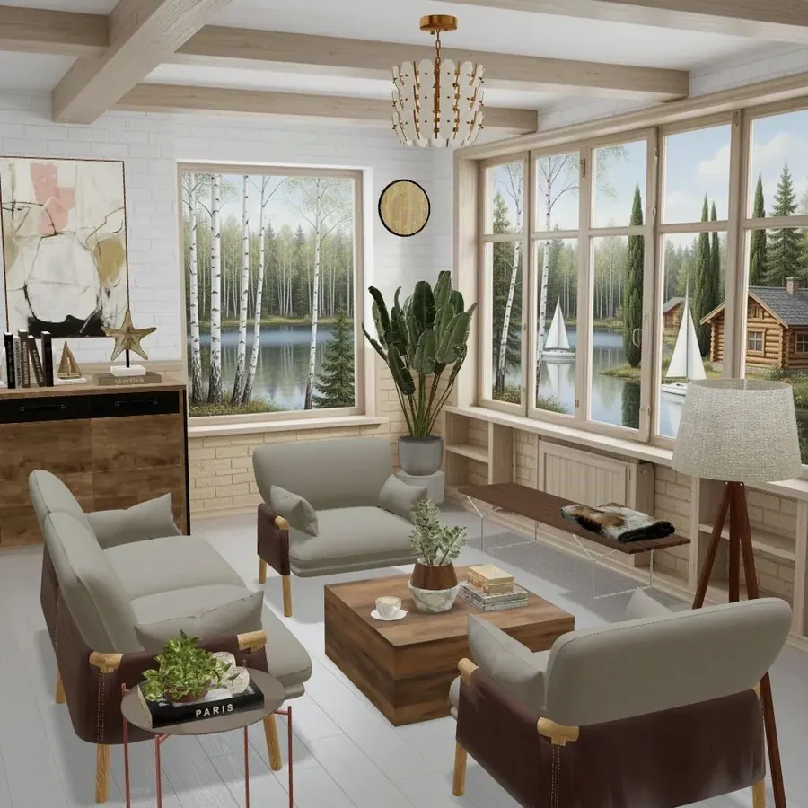
- Something round in a room full of straight lines (a round mirror, a drum side table, a globe pendant).
- A rough material next to a smooth one: linen against leather, a jute rug under a velvet chair. Our guide to mixing materials and textures goes deeper.
The trick is to keep one side dominant. A room that is 80% calm and 20% contrast feels lively; a room that is 50/50 can feel restless.
5. Scale and proportion: right size, right relationships
Scale is how big something is relative to the room and to people. Proportion is how parts relate to each other. A deep sectional can be the right scale for a big open-plan room and completely wrong in a small study; a tiny lamp on a massive console is a proportion problem.
Some widely used rules of thumb:
- A coffee table about two-thirds the length of the sofa.
- Art over a sofa or bed about two-thirds to three-quarters of its width.
- Rugs big enough for at least the front legs of the main seating to sit on them.
Many designers also use the golden ratio (roughly 1 : 1.6, or about 60/40) as a loose guide for dividing a space or a wall: a shelf that splits a wall at about 60/40 usually looks better than one dead in the middle. Treat it as a feel, not a formula. Our scale, proportion and flow guide has the full measurements.
6. Harmony and unity: one room, one story
Harmony is the sense that everything belongs together. It doesn’t mean matching. It means a few things are shared: a limited color palette, a consistent level of formality, a common material or a repeated shape.
A quick test: describe the room in three words (“warm, earthy, relaxed”). If a piece doesn’t fit those words, it’s probably what’s breaking the harmony. Knowing your style helps a lot here; our guide to interior design styles and the style quiz are good places to start.
Unity also works between rooms. If you can see from one room into the next, carry at least one color or material through so the home reads as a whole.
7. Detail: the finishing layer
Details are the small decisions that make a room feel considered: the cushion piping, the lamp shade trim, the hardware on a cabinet, the frame around a print, the bowl on the coffee table. They’re the last layer, not the first, but skipping them is why a room can look right in a photo and still feel generic in person.
Good details follow the same principles as the big pieces. Repeat a finish (all brass, or all black metal), keep the color story, and give each detail space so it can be noticed.
The principles at a glance
| Principle | The question to ask | Quick fix if it’s off |
|---|---|---|
| Balance | Does one side or one level feel heavier? | Move a heavy piece, add height or weight to the light side |
| Rhythm | Does my eye travel, or get stuck? | Repeat an accent color or shape three times |
| Emphasis | What do I see first when I walk in? | Pick one focal point and arrange the seating toward it |
| Contrast | Does the room look flat? | Add one dark, one round and one rough element |
| Scale and proportion | Does anything look too big or too small? | Check the two-thirds rules; size up rugs and art |
| Harmony | Do all the pieces tell one story? | Limit the palette; remove what doesn’t fit your three words |
| Detail | Does it feel finished up close? | Upgrade hardware, frames and shades; repeat one finish |
A 10-minute room checklist
Stand in the doorway with your phone camera on (a photo shows imbalance faster than your eyes do) and work through this:
- I can name the focal point in one word.
- The main seating faces it or can see it.
- Neither side of the room looks heavier than the other.
- Something draws the eye above sofa height.
- My main accent color appears at least three times.
- There’s at least one round shape and one rough texture.
- The rug reaches the front legs of the seating.
- The art over the sofa or bed is roughly two-thirds of its width.
- Every piece fits my three words for the room.
- Metal finishes and frames repeat rather than all differ.
If you’re starting from bare walls, pair this list with our step-by-step on how to furnish an empty room.
Try it in Cozee
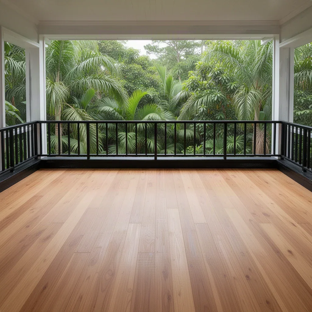
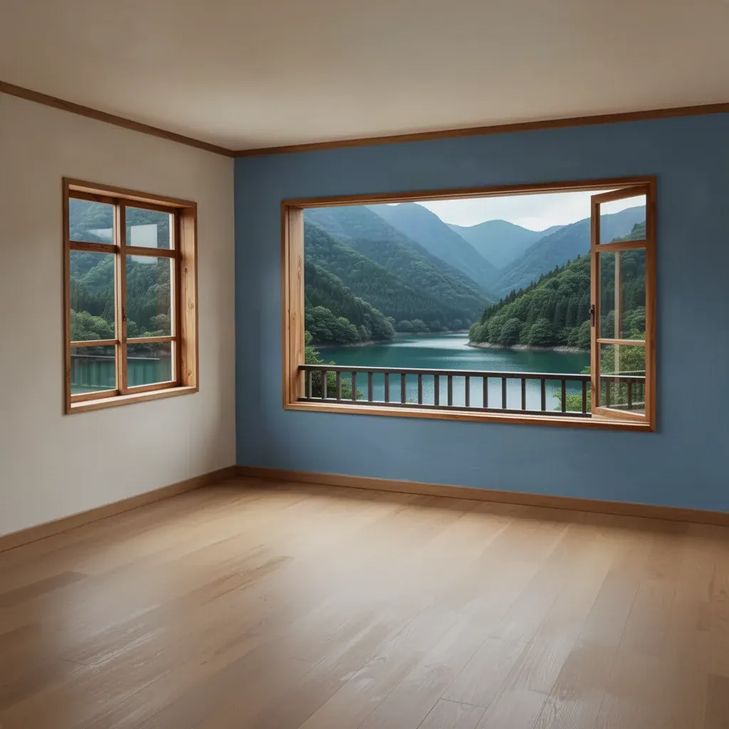
The fastest way to learn these principles is to break them on purpose and see what happens. Cozee is a free interior design game for iPhone and Android where every room starts empty and you furnish it with real 3D furniture and decor, so you can try a symmetrical layout, then an asymmetrical one, and compare. Other players rate each design, and you can browse how others styled the same room, which is a quick way to see which principles they leaned on.
Questions people ask
What are the 7 principles of interior design?
The list most designers use is balance, rhythm, emphasis (a focal point), contrast, scale and proportion, harmony (or unity) and detail. Some teachers merge or split a few of them, so you’ll also see lists of five or eight, but the ideas behind them are the same.
Which design principle matters most?
Balance and scale tend to fix the most problems. A room where the visual weight is evenly spread and the furniture suits the size of the space already feels calm, even before you add color or decor.
What is the difference between scale and proportion?
Scale is how big something is compared with the room or with people. Proportion is how the parts relate to each other, such as a lamp shade to its base or a coffee table to the sofa. A piece can be the right scale for the room and still look odd next to the things around it.
Do I need to follow every principle in every room?
No. They’re tools for diagnosing why a room feels off, not a checklist you must tick. Many great rooms break one principle on purpose, for example by skipping symmetry or by using one oversized piece, while keeping the others in place.
What is visual weight?
Visual weight is how much a piece draws the eye and seems to ‘weigh’ in a room. Dark colors, large size, bold pattern, solid bases and shiny surfaces all feel heavier; pale colors, open legs, glass and thin frames feel lighter.
Try it in an empty room first
Cozee is a free interior design game for iPhone and Android. Pick an empty 3D room, fill it with real furniture, and see what the community thinks.
4.7 on the App Store · Free, with optional in‑app purchases