

On this page 11 sections
Mixing materials well comes down to three moves: choose a small family of materials that suit the mood, make the differences between them clear (rough next to smooth, matte next to shiny, light wood next to dark), and repeat each one more than once so the room looks planned. This guide covers how to mix wood tones, metals, fabrics and stone, with a pairing table, a checklist and the mistakes that make a room look flat or chaotic.
Why texture matters as much as color
Two rooms can share the exact same palette and feel completely different. One has a smooth plaster wall, a velvet sofa and a polished marble table; the other has limewash, a linen slipcover and a scrubbed oak table. Same beige, cream and brown. One feels formal and glamorous, the other relaxed and rustic.
That’s because texture does three jobs:
- It sets the mood. Glossy, hard and smooth reads as sleek, formal or modern. Matte, soft and irregular reads as cozy, casual and natural.
- It adds depth when color is quiet. A neutral room only works if the materials vary. Without texture, beige becomes “beige soup”.
- It changes how light behaves. Shiny surfaces bounce light and make a room brighter. Matte and rough surfaces absorb it and make a room feel softer and warmer.
Designers talk about two kinds of texture. Tactile texture is what you can actually feel: a wool rug, a rough stone wall. Visual texture is what only looks textured: a marble print, a wood-grain laminate, a busy wallpaper. Both count, but real tactile texture is what makes a room feel cozy up close.
The basic rules of mixing
1. Contrast on purpose
Put opposites next to each other so each one shows. A few classic pairs:
- Rough and smooth: a linen cushion on a leather chair.
- Matte and shiny: a brass lamp on a matte black side table.
- Soft and hard: a sheepskin over a metal or wooden chair.
- Organic and geometric: a wavy-edged mirror over a crisp rectangular console.
- Heavy and light: a chunky stone coffee table with a slender cane chair.
2. Repeat everything at least twice
A single material that appears once looks like an accident. If you have a brass floor lamp, echo brass somewhere else in the room: a picture frame, a drawer pull, a candleholder. If you have one walnut piece, add a second walnut thing across the room. Repetition is what turns “mixed” into “curated”.
3. Give one material the lead
Borrow the logic of the 60-30-10 color rule (covered in our color theory guide). One material family dominates, a second supports it, and a third is the accent. In a living room that might be about 60% warm wood and linen, 30% wool and woven fibers, and 10% black metal. The percentages are a loose guide, not a formula; the point is that the materials shouldn’t all compete equally.
4. Keep undertones related
Every material has a warm or cool undertone. Oak, brass, terracotta, cream linen and cognac leather are warm. Chrome, grey concrete, white marble, ash and blue-grey slate are cool. You can mix the two, but the room feels calmer when most materials share a temperature and the opposite temperature is used as a deliberate accent.
How to mix wood tones
Wood is where most people get nervous, and it’s simpler than it looks.
- Start from the floor. Your floor is usually the biggest wood surface, so treat it as the dominant tone and choose furniture to work with it.
- Go for clear contrast. Pale oak with walnut looks intentional. Two woods that are almost the same color look like a failed match.
- Match undertones. Look at the color under the grain: yellow-orange (warm), red (warm), or grey (cool). Red cherry next to grey-washed oak tends to clash; honey oak with walnut usually works.
- Repeat each tone. Two or three wood tones in a room is plenty, and each should appear at least twice.
- Separate them. A rug between a wooden floor and a wooden coffee table stops the two from fighting.
- Match the grain mood. Bold, open grains (oak, ash) look more casual; tight, smooth grains (maple, cherry, birch) look more refined.
How to mix metals
The common rule: one dominant metal, one accent. For example, matte black for curtain rods, lamps and frames, plus brass for a few smaller pieces. Keep the finish types consistent too: brushed metals mix more easily with each other than with highly polished ones.
Metals carry style signals. Brass and gold lean warm and traditional or glam; chrome and polished nickel lean modern and cool; black iron leans industrial or farmhouse; copper and bronze lean warm and rustic.
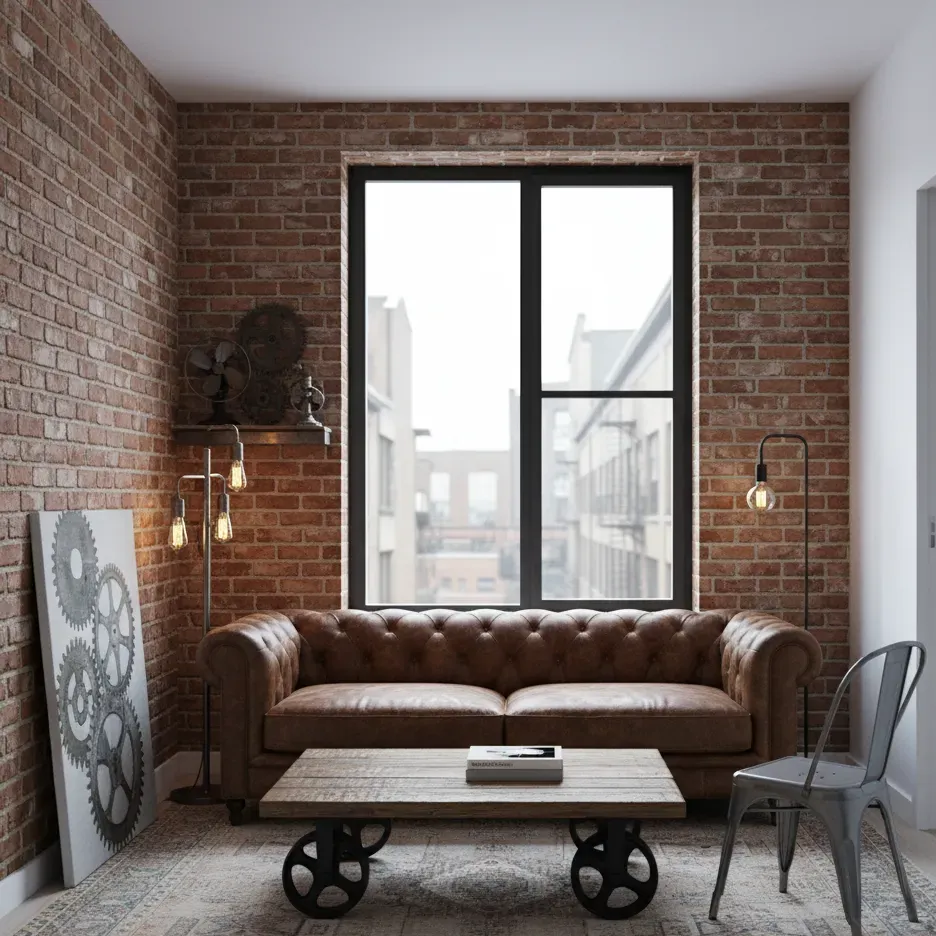
That industrial version is a good study in contrast within a tight material family. Every surface is hard-wearing and a little rough, but the leather is soft against the brick, the wheels are heavy against the thin metal chair, and the low-pile rug softens the floor.
Material pairings that work
| If your main material is | Pair it with | For a mood that feels |
|---|---|---|
| Pale oak or ash | Linen, wool, white ceramic, black metal | Light, Scandinavian, calm |
| Walnut or dark wood | Bouclé, brass, cream plaster, leather | Warm, mid-century, grown-up |
| Rough stone or brick | Leather, reclaimed wood, iron, wool | Rustic or industrial |
| Marble | Velvet, brass, lacquer, glass | Polished, glam, formal |
| Rattan, cane or jute | Cotton, terracotta, light wood, plants | Relaxed, boho, coastal |
| Concrete | Warm wood, felt, leather, matte black | Modern, minimal, urban |
| Velvet | Smooth wood, metal, linen, marble | Rich, moody, luxurious |
Layering textiles
Fabrics are the easiest and cheapest place to add texture, because you can change them seasonally.
- Start with the big pieces. Sofa upholstery, curtains and the rug are your base. Keep these fairly calm.
- Add a contrasting throw. A chunky knit on a smooth leather sofa, or a flat linen throw on a nubby bouclé chair.
- Mix cushion textures, not just colors. In a group of three cushions, try one smooth (cotton or silk), one soft (velvet), one textured (bouclé, knit or embroidered).
- Layer rugs if a room needs warmth. A flat jute or sisal rug with a smaller patterned wool rug on top is a classic combination.
- Vary the scale of any pattern. One large pattern, one medium, one small, ideally sharing a color.
A practical note: rough natural fibers like jute and sisal look lovely but can feel scratchy underfoot and don’t like damp. Wool is softer and more forgiving. Velvet and bouclé show wear in high-use spots, so check the fabric’s durability if you have pets or children.
Hard materials: stone, ceramic, glass and plaster
- Stone and marble add weight and permanence. Marble is porous and can stain or etch from acidic drinks, so it suits a side table better than a busy breakfast spot unless it’s sealed and you don’t mind patina.
- Ceramics are the quickest way to add handmade texture: an unglazed lamp base, a stoneware vase, a rough bowl.
- Glass and mirror add lightness and reflect light, useful in small or dark rooms. See our small space guide.
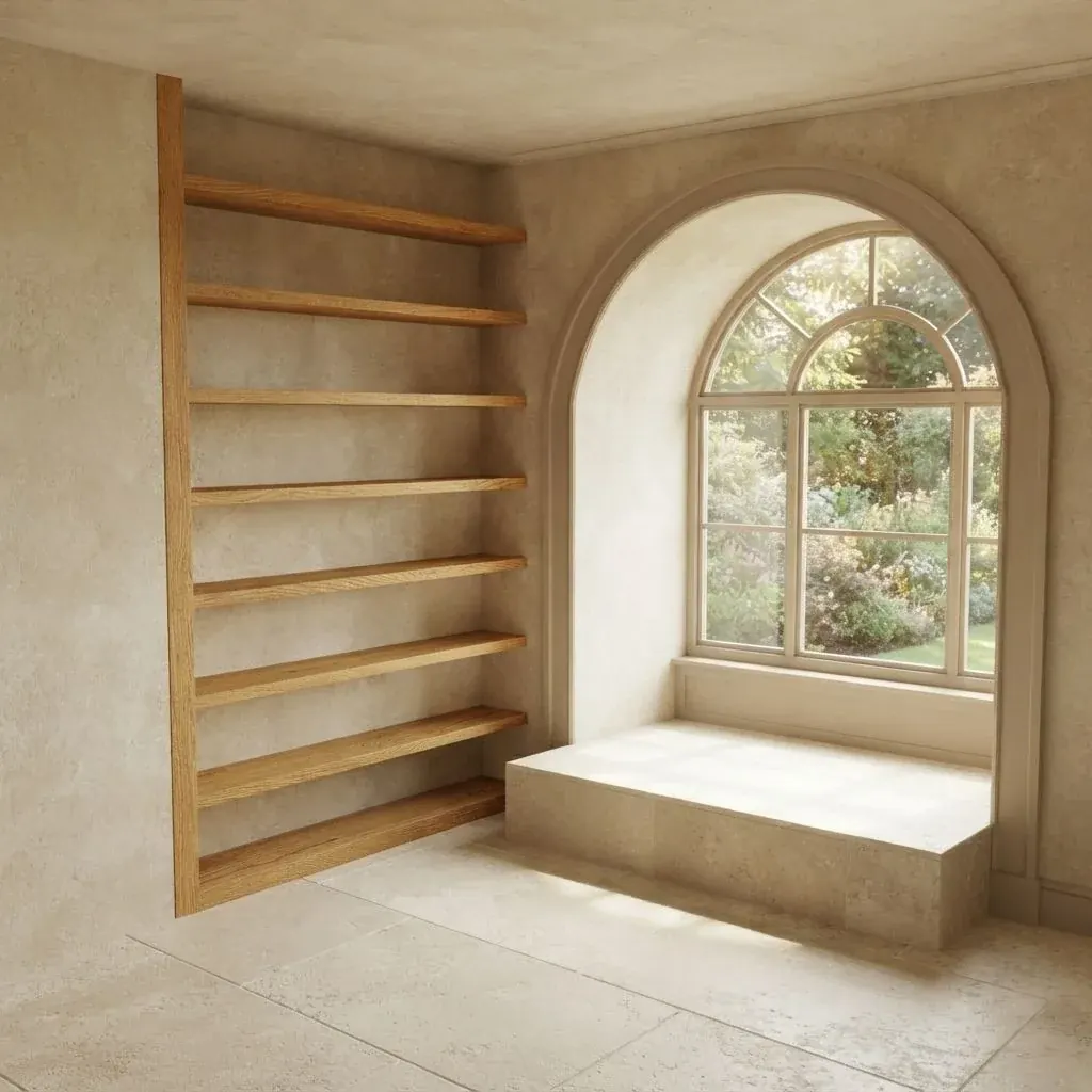
- Plaster, limewash and textured paint give walls a soft, cloudy depth that flat paint can’t.
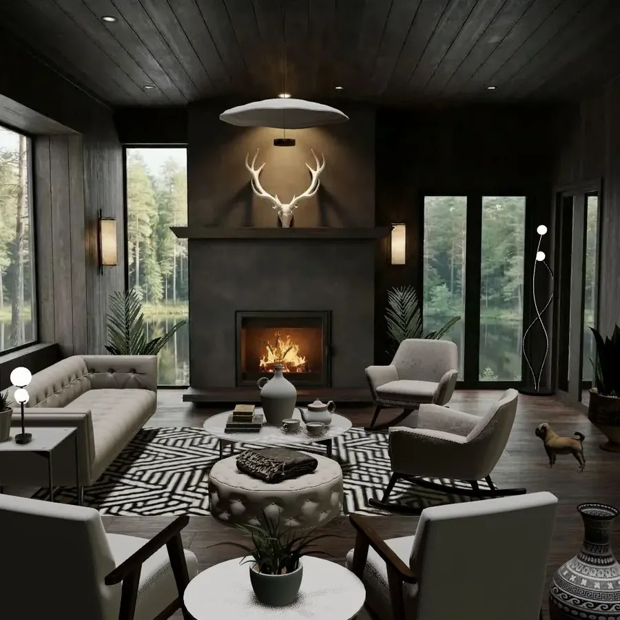
The dark cabin above is almost entirely black, grey and white, yet it holds your eye because the materials change constantly: grooved wood panels, a smooth concrete chimney, button-tufted upholstery, a graphic woven rug and glossy ceramics.
Texture and light
Texture needs light to show. A flat overhead light washes surfaces out; light coming from the side, low down or at an angle (a table lamp next to a stone wall, a window beside a linen curtain) creates the tiny shadows that make texture visible. That’s one reason a room lit only from the ceiling can feel flat even with great materials. Our layered lighting guide covers this in detail.
Common mistakes
- Everything matches. A full set of furniture in one wood and one fabric looks like a showroom. Break it up.
- Everything is different. Six woods, four metals and ten fabrics with no repetition looks chaotic. Edit back to a family.
- All one sheen. All matte feels dull; all glossy feels cold. Aim for mostly matte with a few shiny moments.
- Near-miss wood matches. Either match exactly or contrast clearly.
- Fake texture everywhere. One wood-look laminate is fine; a room of printed textures with nothing real to touch feels hollow.
- Ignoring how things feel. A rug you never want to stand on barefoot isn’t the right rug for a bedroom.
Quick checklist
- One dominant material, one supporting, one accent
- At least one rough, one smooth, one soft and one shiny surface
- Each wood tone and metal appears twice or more
- Undertones mostly warm or mostly cool, with a deliberate exception
- Cushions and throws contrast with the sofa they sit on
- Something natural: wood, plant, stone, wool or clay
- Side or low light to show off the texture

Try it in Cozee
Texture is hard to judge from a mood board, so it helps to see materials side by side in a room. In Cozee, a free design game for iPhone and Android, you furnish empty 3D rooms with real 3D furniture and decor, and from level 5 the pro editor tools include material options for many pieces. Try a one-color room where only the textures change, then compare your version with how other players designed the same Space. For the bigger picture, read the 7 principles of interior design.
Questions people ask
Can you mix different wood tones in one room?
Yes, and most good rooms do. Pick one dominant wood, keep the undertones related (warm with warm, or cool with cool), and make the contrast clear rather than almost-matching. Repeating each wood at least twice makes the mix look intentional.
How many metal finishes can you use in a room?
Two is the easy rule: one main finish for most hardware and fixtures, and one accent. Three can work in a large or eclectic room, but each finish should appear more than once so nothing looks like a stray.
Why does my room look flat even though the colors are right?
Usually because every surface has the same texture and sheen: smooth walls, smooth sofa, smooth floor. Add contrast in feel rather than color: a nubby throw, a woven basket, a matte ceramic lamp, a rough wooden bowl, something with a gentle shine.
What textures make a room feel cozy?
Soft, matte and slightly irregular ones: wool, bouclé, chunky knits, linen, sheepskin, velvet, worn wood, unglazed ceramics and woven fibers like rattan and jute. Pair them with warm light, because texture only shows when light rakes across it.
What is the difference between texture and pattern?
Texture is how a surface feels or would feel to the touch, like the grain of wood or the loops of a bouclé fabric. Pattern is a printed or woven design you see, like stripes or florals. Both add interest, and a room with lots of texture often needs less pattern.
Try it in an empty room first
Cozee is a free interior design game for iPhone and Android. Pick an empty 3D room, fill it with real furniture, and see what the community thinks.
4.7 on the App Store · Free, with optional in‑app purchases