

On this page 8 sections
The most useful rule for hanging art: on an open wall, put the center of the picture about 145–152 cm (57–60 in) from the floor. Above a sofa, bed or sideboard, leave about 15–25 cm (6–10 in) between the furniture and the bottom of the frame, and choose art that covers roughly two-thirds of the furniture’s width. For gallery walls, keep the gaps between frames consistent at around 5–8 cm (2–3 in) and plan the layout with paper templates first. Below is everything else: sizing, layouts, stairs, hardware and the mistakes that make art look off.
How high to hang art
The eye-level rule
Galleries and museums often hang work so its center sits at about 145–152 cm (57–60 in) from the floor. The reasoning is simple: that’s close to average adult eye level, so you look straight at the art instead of up at it. Hanging pictures too high is one of the most common things designers correct in people’s homes.
Treat it as a starting point. If everyone in your home is very tall or very short, shift it a little. Keep the center line consistent around a room so separate pieces feel connected.
When there’s furniture below
Furniture changes the rule, because the art and the piece below it should read as one group.
- Above a sofa: leave about 15–25 cm (6–10 in) between the top of the sofa back and the bottom of the frame.
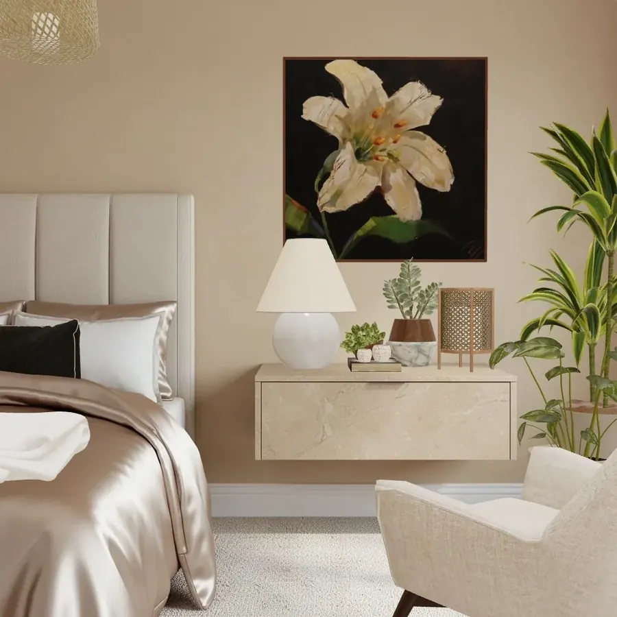
- Above a bed: the same gap above the headboard. Use light frames and secure fixings, because nobody wants a frame falling on a pillow.
- Above a sideboard, console or desk: about 15–30 cm (6–12 in) above the surface, so lamps and objects can overlap the bottom edge slightly.
- Above a mantel: about 10–25 cm (4–10 in) above the mantel shelf, or lean a large piece on the mantel itself.
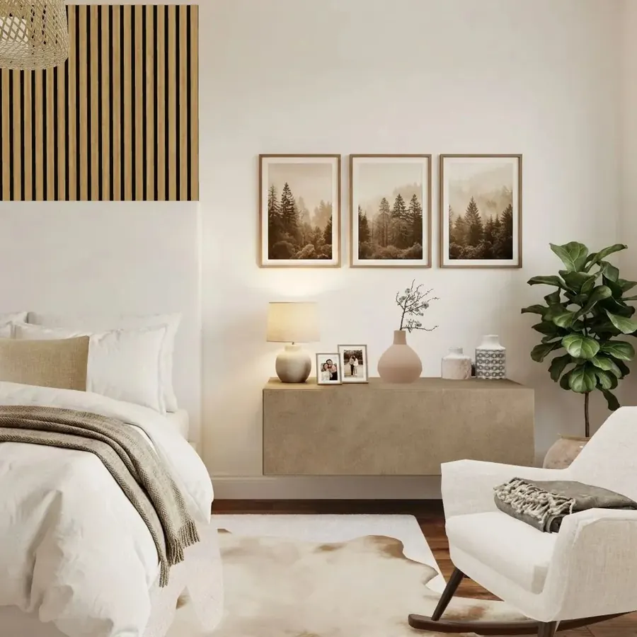
In the cover image, the three forest prints sit a short gap above the floating console, and the lamp and vase overlap their lower edge. That overlap is what ties wall and furniture together.
| Where | Rule of thumb | Metric | Imperial |
|---|---|---|---|
| Open wall | Center of art from floor | 145–152 cm | 57–60 in |
| Above a sofa or bed | Gap to bottom of frame | 15–25 cm | 6–10 in |
| Above a console | Gap to bottom of frame | 15–30 cm | 6–12 in |
| Gallery wall | Gap between frames | 5–8 cm | 2–3 in |
| Art width over furniture | Share of furniture width | about 2/3 | about 2/3 |
How big should the art be?
Art that’s too small for its wall is the other classic mistake. A small print above a big sofa looks lost.
- Over furniture: aim for art (or a grouping) roughly two-thirds of the furniture’s width. A 210 cm (83 in) sofa wants roughly 140 cm (55 in) of art, as one piece or several.
- On an empty wall: a single piece can fill a good share of the wall, but leave a generous margin of plain wall around it so it doesn’t look crammed.
- If you only have small pieces: group them. Three small prints in a row, or a grid of six, act as one large piece.
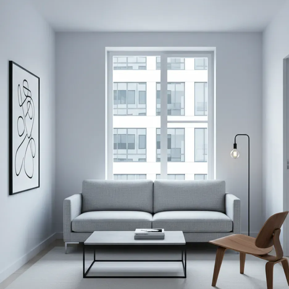
Gallery wall layouts
1. The grid
Identical frames in even rows and columns, with identical gaps. Clean, modern and forgiving of simple art like photos or botanical prints. It needs the most precise measuring.
2. The row (or line)
Frames lined up along a single horizontal line, either with their centers on the same line or their bottom edges on the same line. Perfect above a sofa or along a corridor. The three prints in the cover image are a simple version: same size, same frame, even gaps.
3. The salon hang
Frames of different sizes and styles packed together, edge to edge, floor to ceiling if you like. It looks spontaneous but works best with an invisible structure: keep the outer edges roughly rectangular, put the largest piece slightly off-center, and keep the gaps consistent.
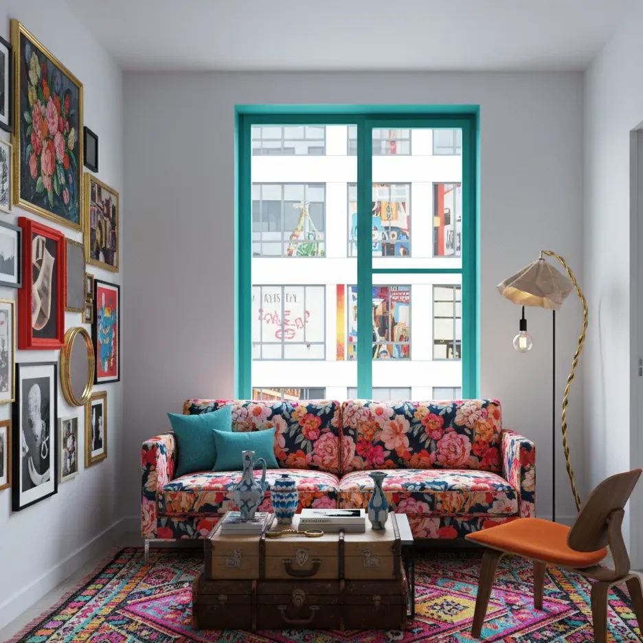
4. The ledge
One or two picture ledges with art leaned and layered, overlapping slightly. It’s the easiest way to change art often and avoids new holes in the wall.
5. Around a central piece
One large anchor piece with smaller frames arranged around it. A good option when you have one favorite artwork and a few supporting ones.
How to plan a gallery wall without extra holes
- Collect everything first. Lay all the frames on the floor and play with arrangements there.
- Pick an anchor. Usually the largest or boldest piece. It goes near the center, slightly off-center for a looser look.
- Balance by weight, not just size. Dark, colorful or heavily framed pieces look heavier. Spread them around so one side doesn’t sink.
- Make paper templates. Trace each frame onto kraft paper, cut it out and mark where the hanging hook or wire falls.
- Tape the templates to the wall with painter’s tape. Live with it for a day and adjust.
- Find the middle. Center the whole group on the furniture below, or on the wall if it stands alone, with the group’s center around 145–152 cm (57–60 in) from the floor.
- Nail through the paper at the hook marks, tear the paper away and hang.
Tips for a cohesive group:
- Repeat one or two frame colors, or use the same mat color throughout.
- Mix orientations: portrait, landscape and the odd round piece (a mirror counts).
- Keep a shared palette in the art itself, even if the subjects differ.
- Mix media for interest: prints, photos, a small textile, a mirror, a sketch.
Staircases and hallways
- Stairs: keep the gallery parallel to the slope of the stairs. A simple method is to measure the eye-level height (around 145–152 cm / 57–60 in) up from the middle of several steps and connect those points into a diagonal line to hang along.
- Hallways: a row of frames along one center line reads best, because you see it walking past rather than standing back.
- Narrow spaces: use slim frames and leave room for shoulders and bags.
Hardware and safety
- Check the weight. Picture hooks, anchors and adhesive strips are rated for a maximum weight. Stay well under it.
- Know your wall. Solid masonry, plasterboard (drywall) and old lath-and-plaster each need different fixings. Heavy pieces should go into a stud or use anchors made for your wall type.
- Use two hooks for wide frames. Two hooks keep a frame level and stop it tilting every time a door slams.
- Bumpers on the back corners stop frames sliding and marking the wall.
- Mind the sun. Direct sunlight can fade photographs, watercolors and prints on paper over time, so hang them away from strong, direct light.
Common mistakes
- Hanging art too high. Check the center line first.
- Art too small for the wall. Go bigger or group pieces.
- Uneven gaps in a gallery wall. Measure, or use a spacer cut to size.
- Art unrelated to the furniture. Keep the gap small so they read together.
- One piece per wall, all at different heights. Keep a shared center line around the room.
- Ignoring the room’s palette. The art should share at least one color with the room, which our color theory guide explains.
If you’re arranging a whole room, not just a wall, our guides to scale and proportion and furnishing an empty room cover the bigger layout decisions.
Try it in Cozee
A gallery wall is easy to practise before you drill anything. In Cozee, a free design game for iPhone and Android, you decorate empty 3D rooms with real 3D furniture and decor, including art, and can move pieces around until the spacing looks right. One of the Designer Tasks in the game is even called Gallery Wall. Try the same wall as a grid, a row and a salon hang, then submit the version you like best and see how other players rate it.
Questions people ask
How high should you hang a picture?
On an open wall, hang it so the center of the picture is about 145–152 cm (57–60 in) from the floor, which is roughly eye level for an average adult. Above furniture, ignore that rule and leave about 15–25 cm (6–10 in) between the top of the furniture and the bottom of the frame.
How far apart should pictures be in a gallery wall?
Most designers keep a consistent gap of about 5–8 cm (2–3 in) between frames. Smaller gaps make the group read as one piece; much bigger gaps make the frames look unrelated. Consistency matters more than the exact number.
What size art should go above a sofa?
A common guideline is that the art, or the whole grouping, should be about two-thirds of the sofa’s width, often quoted as roughly 60–75%. Art that is much narrower than that tends to look like it’s floating.
Should a gallery wall have matching frames?
It doesn’t have to. Matching frames look calm and modern; mixed frames look collected and eclectic. If you mix, give the group a common thread: one frame color repeated, the same mat color, or a shared palette in the art.
How do you hang a picture without damaging the wall?
For light frames, removable adhesive strips or hooks rated for the weight are an option, and a picture ledge lets you swap art without new holes. For anything heavy, use proper wall anchors for your wall type or screw into a stud; adhesive strips are not meant for heavy pieces.
Try it in an empty room first
Cozee is a free interior design game for iPhone and Android. Pick an empty 3D room, fill it with real furniture, and see what the community thinks.
4.7 on the App Store · Free, with optional in‑app purchases