

On this page 14 sections
Most rooms that feel “off” share the same handful of problems: a rug that’s too small, furniture pushed against the walls, art hung too high, curtains hung too low and narrow, and a single ceiling light doing all the work. The good news is that almost every one of them has a simple, mainstream fix. Here are the twelve mistakes designers point out most often, with the measurements to correct them.
1. The rug is too small
A small rug floating in the middle of the floor makes the furniture around it look like it’s drifting apart.
The fix: in a living room, choose a rug big enough for at least the front legs of the sofa and chairs to sit on it. In a typical room that’s at least 160 × 230 cm (about 5 × 8 ft) and often 200 × 300 cm or bigger. Leave roughly 20–45 cm (8–18 in) of bare floor between the rug and the walls. In a bedroom, the rug should extend at least 45–60 cm (18–24 in) beyond the sides of the bed, so your feet land on it when you get up. Under a dining table, it should be large enough that chairs stay on the rug when pulled out.
2. All the furniture is pushed against the walls
Lining every wall with furniture leaves a big empty middle and puts people too far apart to talk comfortably.
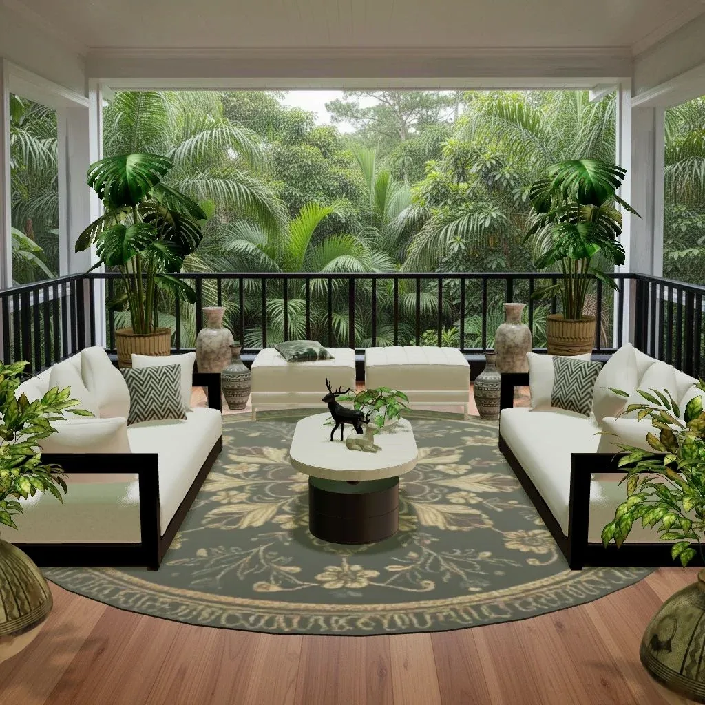
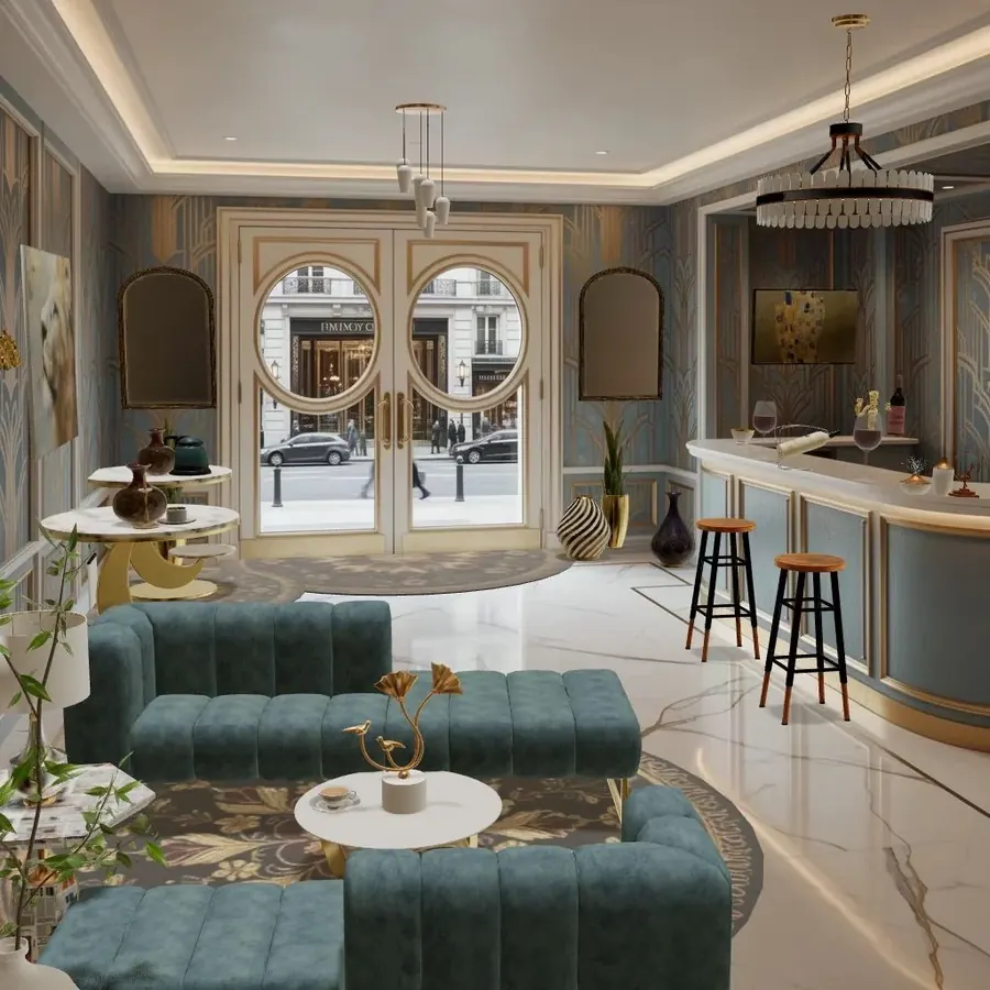
The fix: pull the sofa and chairs into a group, facing each other or the focal point, ideally on one rug. Even 10–20 cm off the wall helps. In larger rooms, “float” the sofa in the middle of the room with a console table behind it. The cover image shows the idea at lobby scale: two sofas face each other across a round coffee table, both on a round rug, well away from the walls.
3. Art hung too high (or too small)
Art hung near the ceiling floats away from the furniture and the people in the room. A small picture alone on a big wall looks lost.
The fix: hang art so its center sits at about 145–152 cm (57–60 in) from the floor, roughly eye level. Above a sofa, bed or sideboard, leave 15–25 cm (6–10 in) between the furniture and the frame, and aim for art about two-thirds the width of the piece below it. If one picture is too small, group several into a single arrangement. Our guide to hanging art and planning a gallery wall has the full method.
4. Curtains hung low and narrow
A rod fixed just above the window frame, with curtains that stop at the sill, makes the window look smaller and the ceiling lower.
The fix: mount the rod at least 10–15 cm (4–6 in) above the frame, or higher (up to just under the ceiling), and extend it 15–30 cm (6–12 in) past each side so open curtains sit on the wall rather than over the glass. Let panels touch the floor. For fullness, the combined width of the panels is usually around one and a half to two times the width of the window.
5. Relying on one ceiling light
A single overhead light flattens a room, throws shadows under people’s eyes and makes evenings feel like an office.
The fix: add light at different levels. Every living room benefits from at least three sources: an overhead or pendant for general light, a floor lamp or table lamps at seating height, and something low or accent (a lamp on a shelf, a picture light, wall lights). Use warm bulbs, around 2700–3000K, and dimmers where you can. See how to light a room in layers.
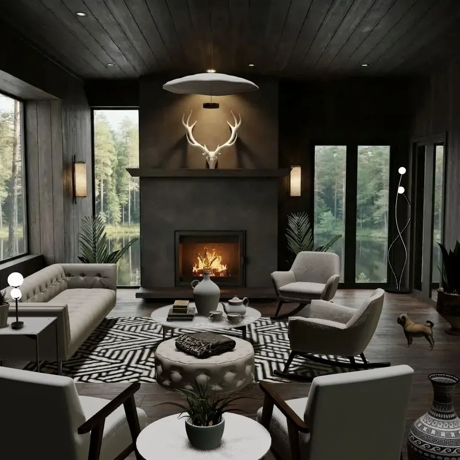
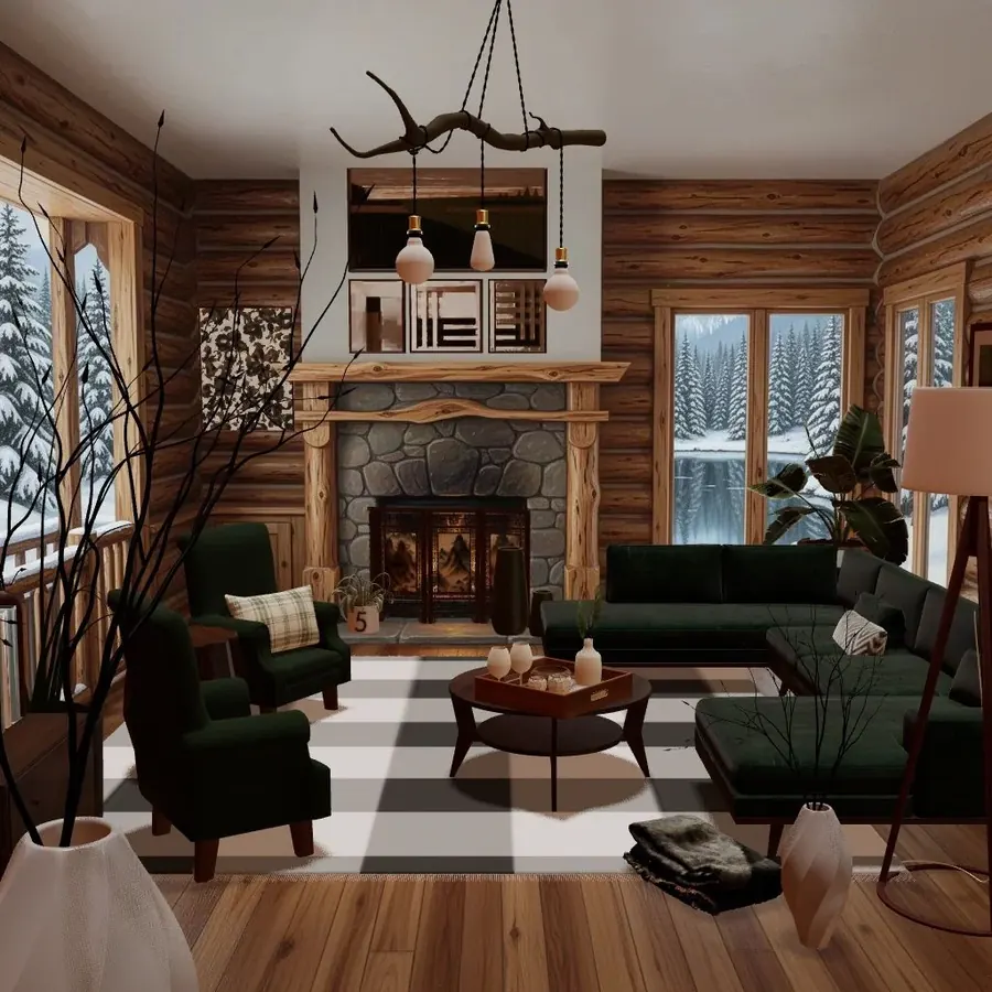
Even in a room with black walls, that cabin reads as warm and inviting because its lights sit in five or six places at different heights, not one.
6. Choosing paint from a tiny chip
A color that looks perfect on a 3 cm chip under shop lights can look completely different on four walls in your own light.
The fix: paint large samples, at least A4 or letter-size, on more than one wall. Look at them in morning, afternoon and evening light, and with your lamps on. Check them against things that aren’t changing (the floor, the sofa, kitchen cabinets). Rooms facing away from the sun get cooler, greyer light; rooms facing the sun get warmer light that can make warm colors look stronger.
7. Ignoring scale
An enormous sectional in a small room, or a tiny loveseat in a big one, makes everything else look wrong. So does a coffee table the size of a stool in front of a long sofa.
The fix: measure before you buy, and mark the footprint of big pieces on the floor with painter’s tape. Some handy proportions: a coffee table about two-thirds the length of the sofa, 35–45 cm (14–18 in) from its front edge; side tables roughly level with the sofa arm; a pendant over a dining table about 75–90 cm (30–36 in) above the tabletop. In tall rooms, choose pieces with height (tall plants, big lamps, large art) so the space above isn’t empty. More in scale, proportion and flow.
8. Buying everything as a matching set
A sofa, loveseat and armchair in the same fabric, or a bedroom suite where the bed, nightstands and dresser all match, can look like a showroom rather than a home.
The fix: keep a common thread (one wood tone, one color, one shape) but vary the pieces. Pair a sofa with chairs in a different fabric. Mix the nightstands with a dresser in another finish. Add one old or secondhand piece to a new room.
9. No focal point, or too many
If nothing in a room draws the eye, it feels bland. If a statement wallpaper, a gallery wall, a big TV and a bold rug all compete, it feels chaotic.
The fix: decide what the room is looking at: the window, the fireplace, a bed headboard, one big artwork or a bookcase. Arrange seating toward it and keep the strongest color and pattern there. Let everything else support it. The design principles guide explains emphasis and balance in more depth.
10. Too many small things
Lots of small accessories on every surface read as clutter, not personality, and they make a room harder to clean.
The fix: edit. Group small objects into a few deliberate arrangements, often in odd numbers and at different heights, and leave some surfaces empty. One large vase does more than five small ones. On shelves, mix books with a few objects and leave gaps; our shelf styling guide walks through it.
11. Everything has the same texture
A room where everything is smooth (painted walls, a leather sofa, a glass table, a laminate floor) can feel cold and flat even if the colors are lovely.
The fix: mix at least three or four textures: something woven (a jute rug, a basket), something soft (wool, linen, velvet), something natural and hard (wood, stone, ceramic) and a little shine (metal, glass). This matters most in neutral rooms, where texture does the job that color would otherwise do. See how to mix materials and textures.
12. Blocking the walkways
Furniture that forces you to turn sideways or step around it every day makes a room feel cramped and stressful, however good it looks in photos.
The fix: keep main walkways about 75–90 cm (30–36 in) wide, and minor ones at least 60 cm (24 in). Check that doors, drawers and wardrobe doors open fully. In a dining room, leave at least 90 cm (36 in) between the table edge and the wall so people can pull out chairs, and 105–120 cm (42–48 in) if people need to walk behind them.

That room avoids several mistakes at once: each seating group sits on its own rug, there’s a clear path between them, and the oversized lantern is big enough to hold its own under the high timber ceiling.
A quick room check
Run through this list before you buy anything new:
- Do the front legs of the seating sit on the rug?
- Is the seating grouped, not lined up against the walls?
- Is art centered around 145–152 cm (57–60 in)?
- Are curtain rods high and wide, with curtains reaching the floor?
- Are there at least three light sources, with warm bulbs?
- Has the paint been tested on the wall in your own light?
- Does each piece suit the size of the room and its neighbors?
- Is there one clear focal point?
- Are there some empty surfaces?
- Are there at least three different textures?
- Can you walk through without turning sideways?
Try it in Cozee
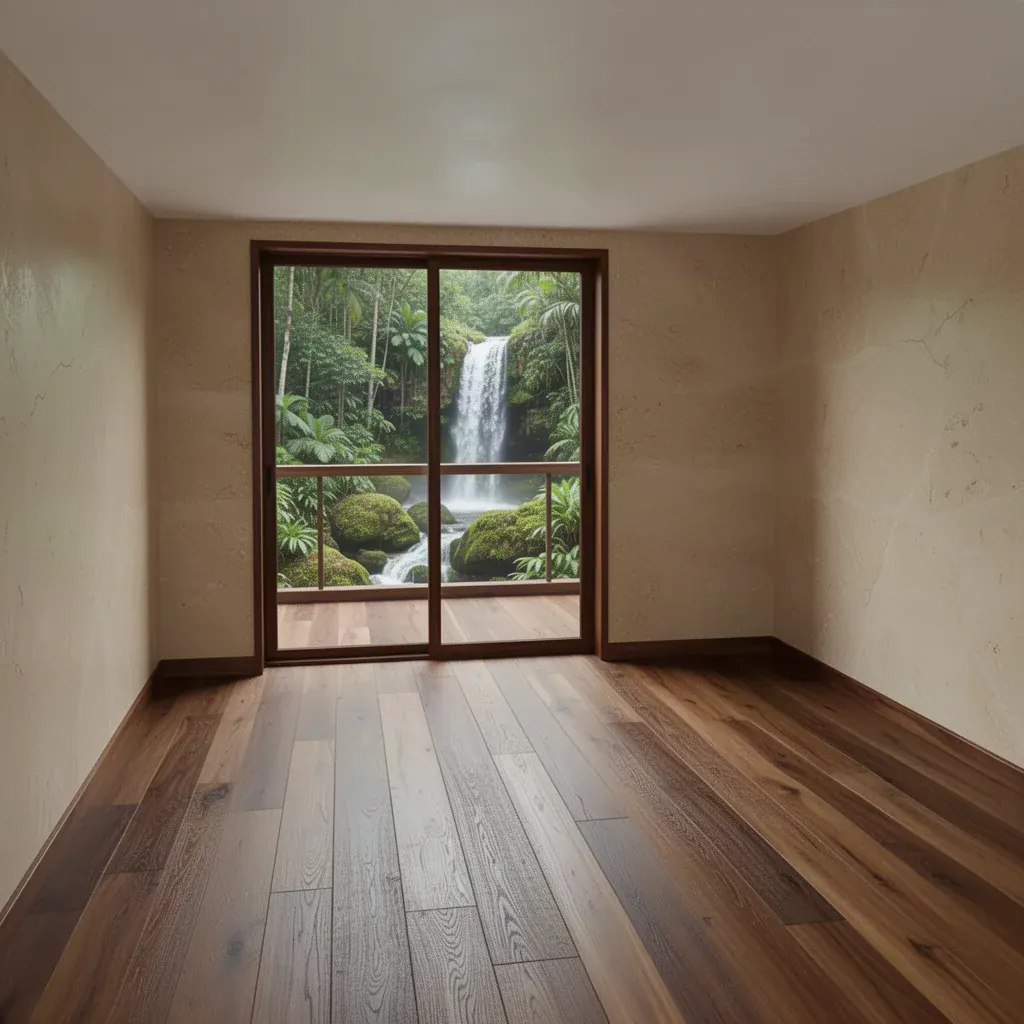
Most of these mistakes are easier to spot when you can move things around freely. In Cozee, a free interior design game for iPhone and Android, every room starts empty and you design it with real 3D furniture and decor. Try fixing one mistake at a time (a bigger rug, a regrouped seating area, art at a better scale) and see how the room changes, then compare your version with how other players designed the same room. If you’re on a tight budget, our guide to a budget room makeover is a good next read.
Questions people ask
What is the most common decorating mistake?
A rug that is too small is one of the most common. It should be large enough for at least the front legs of the sofa and chairs to sit on it; a small rug in the middle of the floor makes the furniture look disconnected.
How high should you hang pictures?
Hang art so its center is roughly at eye level, about 145–152 cm (57–60 in) from the floor. Above a sofa or sideboard, leave a gap of about 15–25 cm (6–10 in) between the top of the furniture and the bottom of the frame.
Why does my room look unfinished?
Usually one of three things is missing: a rug that anchors the furniture, light from more than one source, or texture. Rooms with bare floors, a single ceiling light and only smooth surfaces tend to look half-done even when they’re full of furniture.
Should curtains touch the floor?
In most rooms, yes. Curtains that just touch the floor, or break slightly onto it, look finished and make the window look taller. Curtains that stop above the floor tend to look as if they’ve shrunk, unless they’re short café curtains on purpose.
Try it in an empty room first
Cozee is a free interior design game for iPhone and Android. Pick an empty 3D room, fill it with real furniture, and see what the community thinks.
4.7 on the App Store · Free, with optional in‑app purchases